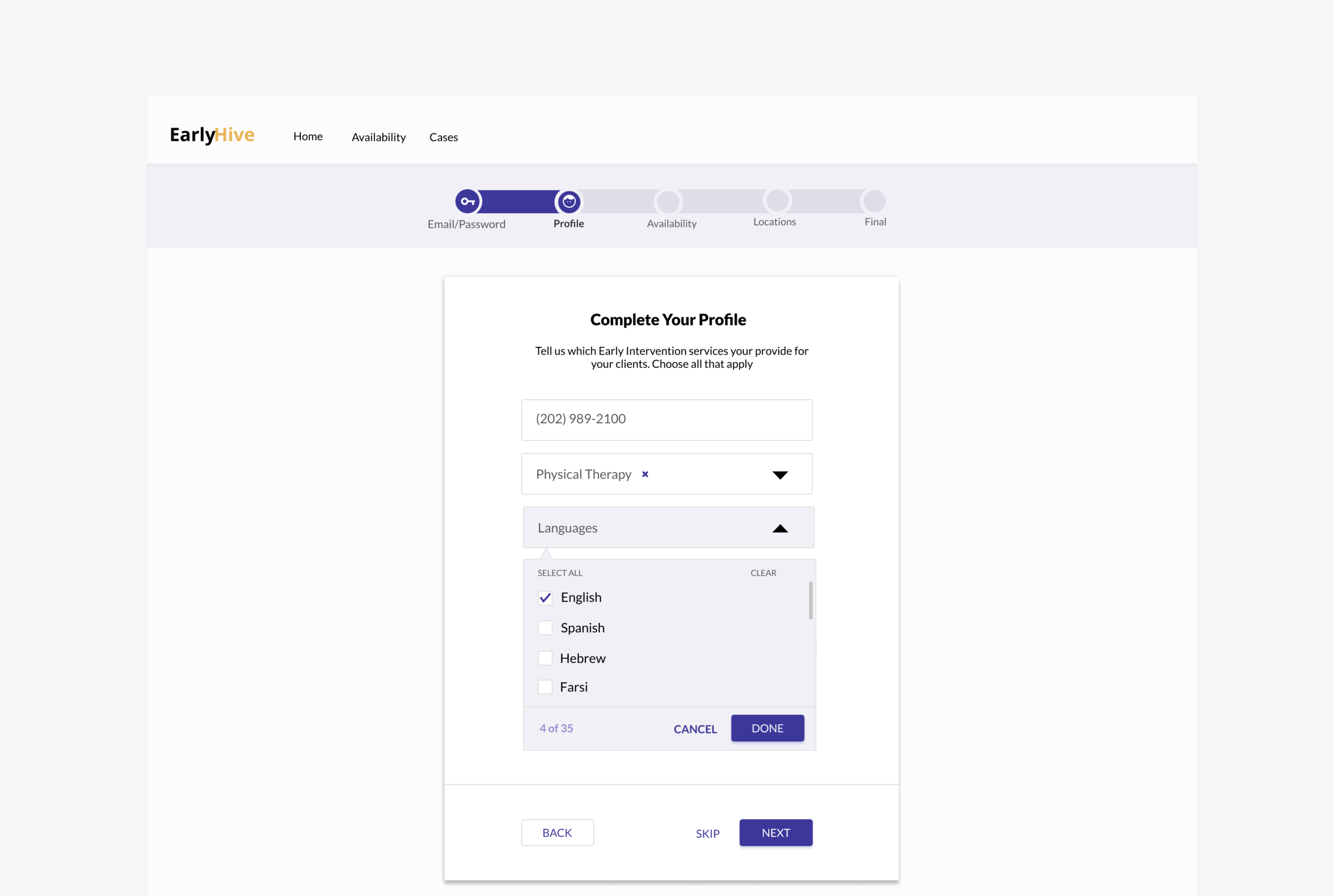
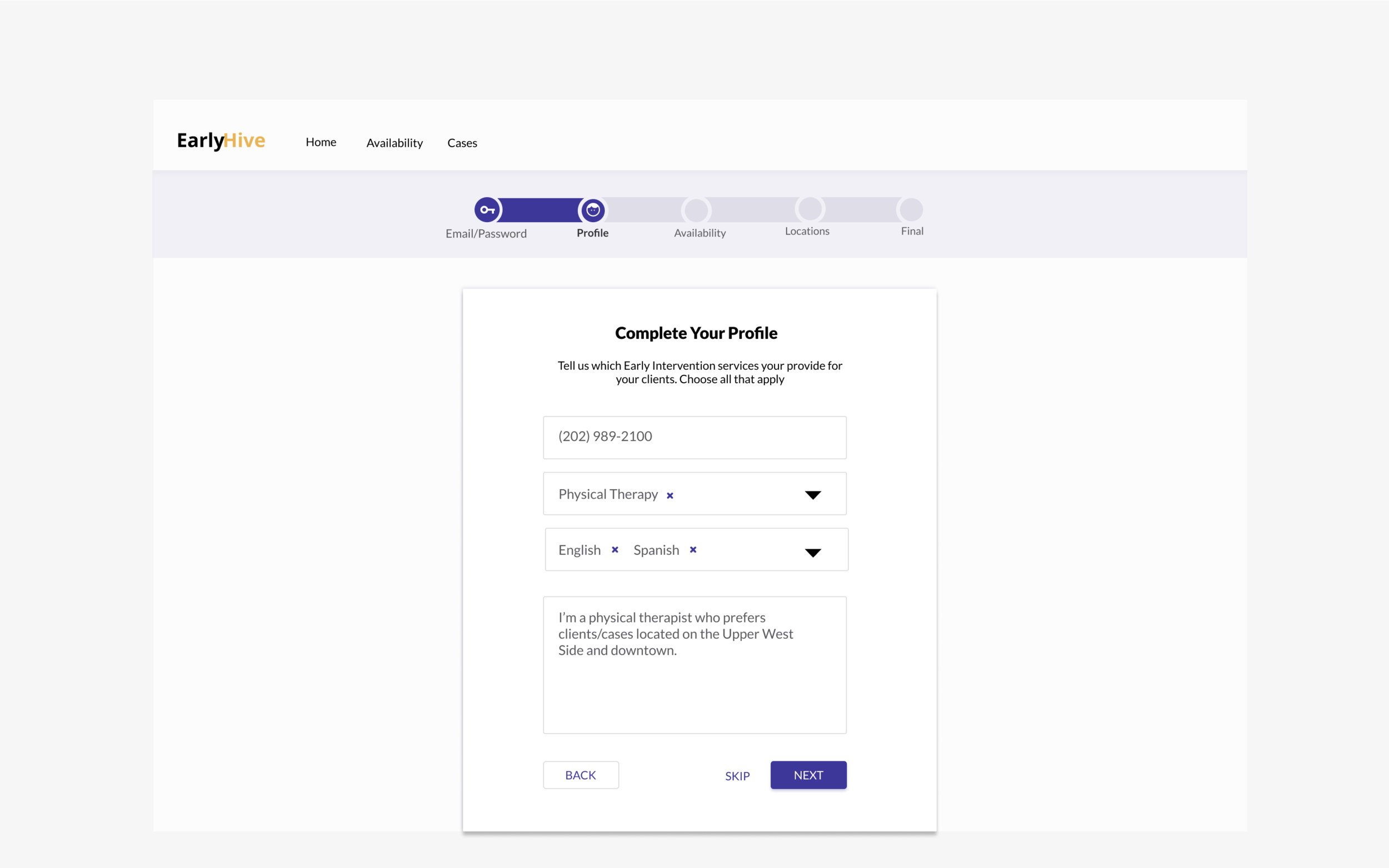
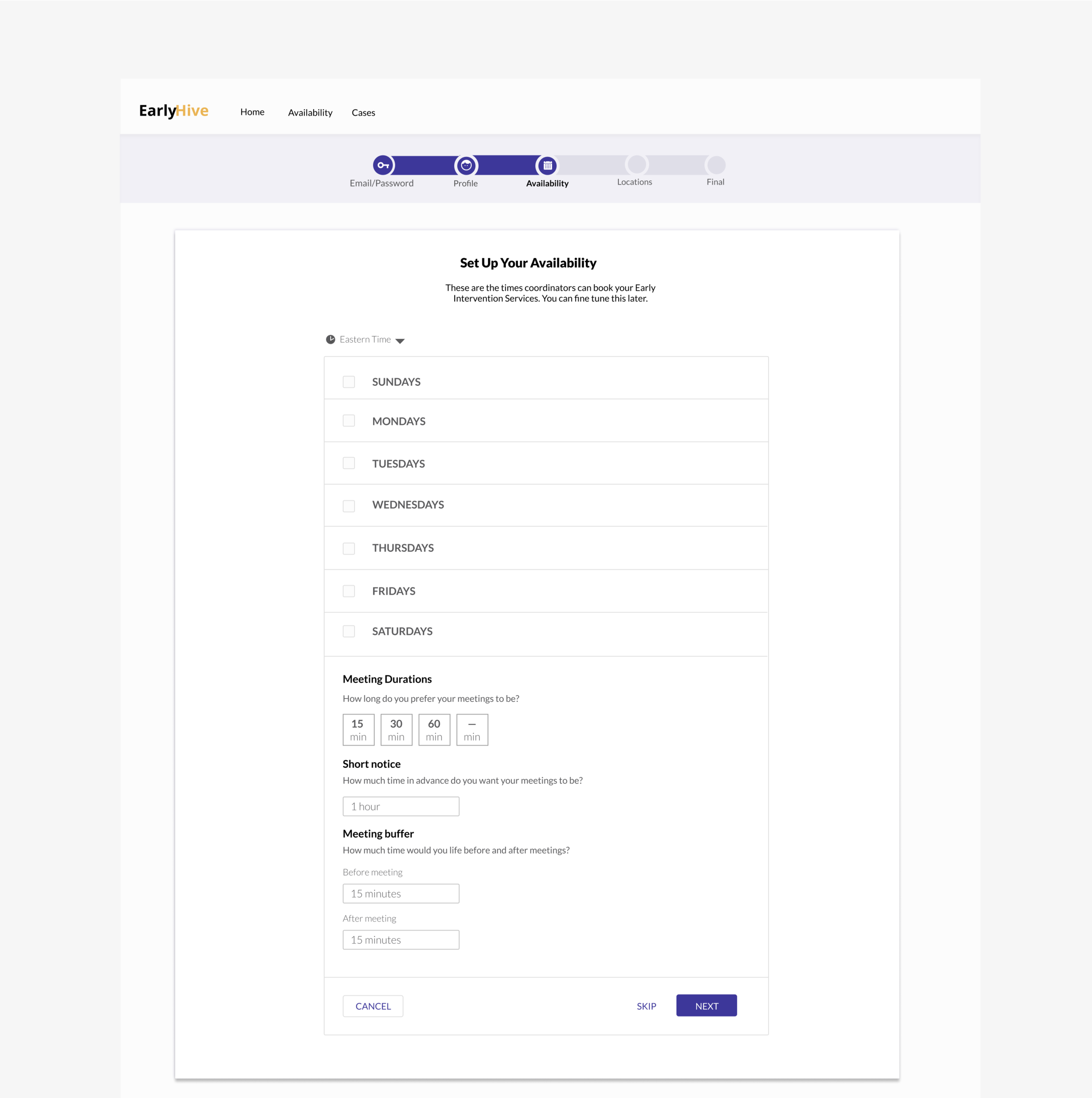
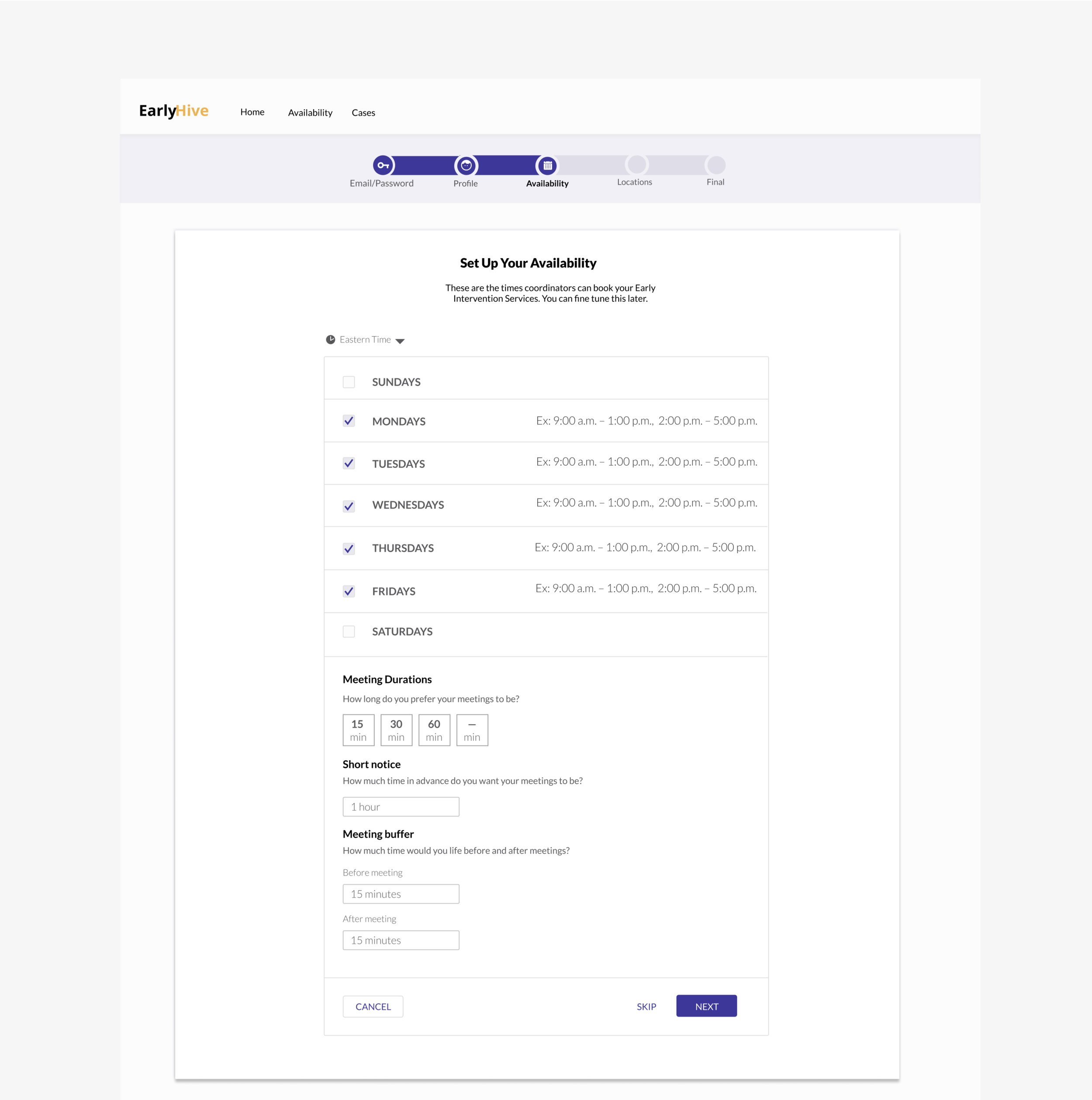
Prototype
Research Method & Purpose
Usability Testing: Test website user flows
User Flow/IA Analysis: Usability problems, clarity of site copy
Synthesis Method & Purpose
4-List Method: Pains, behaviors, context, pleasures
Feature Prioritization: MVP and Nice to Have features
Design Studio: Site architecture
Prototyping: Test website iterations
INSIGHTS
Business goals: Foster a sense of community around the platform
User Goals: Search online for either a case or a provider
Technical constraints: Web-based platform
Situation:
New York City children with disabilities or developmental delays receive Early Intervention services at no cost to families. Right now, the average wait time is 30-45 days to receive services.
EarlyHive's web-based platform significantly cuts down wait times for children receiving therapy services. EarlyHive allows agency coordinators to search a database of providers in close proximity to the child's geographical area, and cuts out hours of wasted time coordinators now spend finding a provider via phone or email. Providers can quickly accept a new case through the platform.
Context:
A service coordinator is assigned to the family to develop an Individual Family Service Plan (IFSP). The coordinator must find a provider to work with the family and help the child learn.
Services Offered
Areas of development include: cognitive, physical, communication, social/emotional, and adaptive development.
Providers in the ecosystem offer services in: audiology, occupational therapy, physical therapy, speech-language pathology, vision services, health services, psychological services, service coordination, social work services, nursing services, and nutrition services.
Initial Prototype
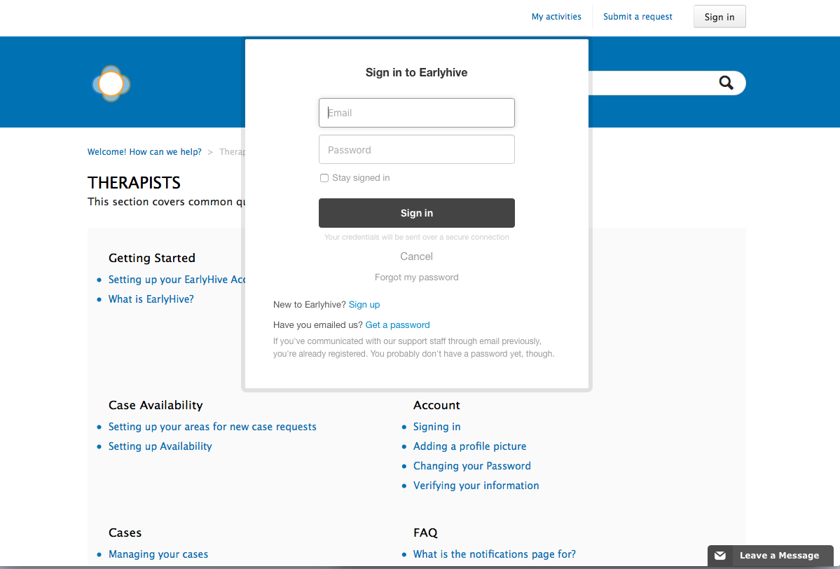
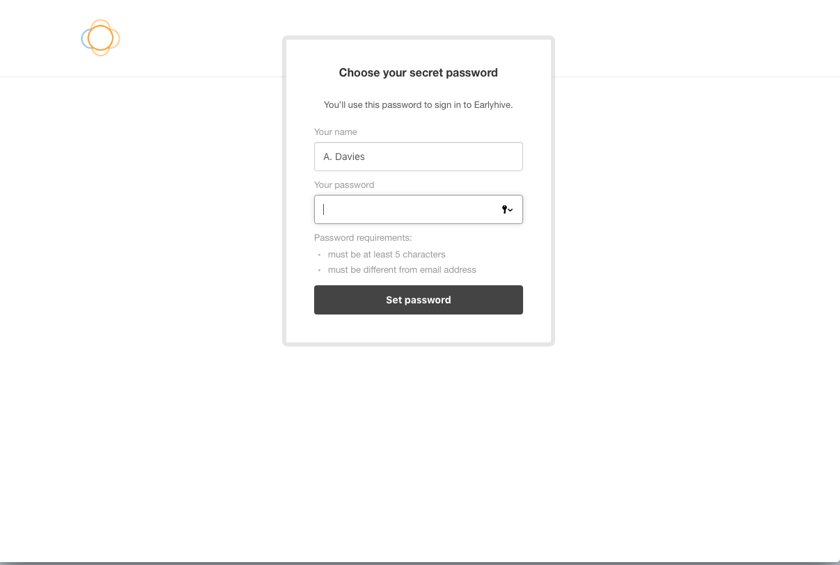
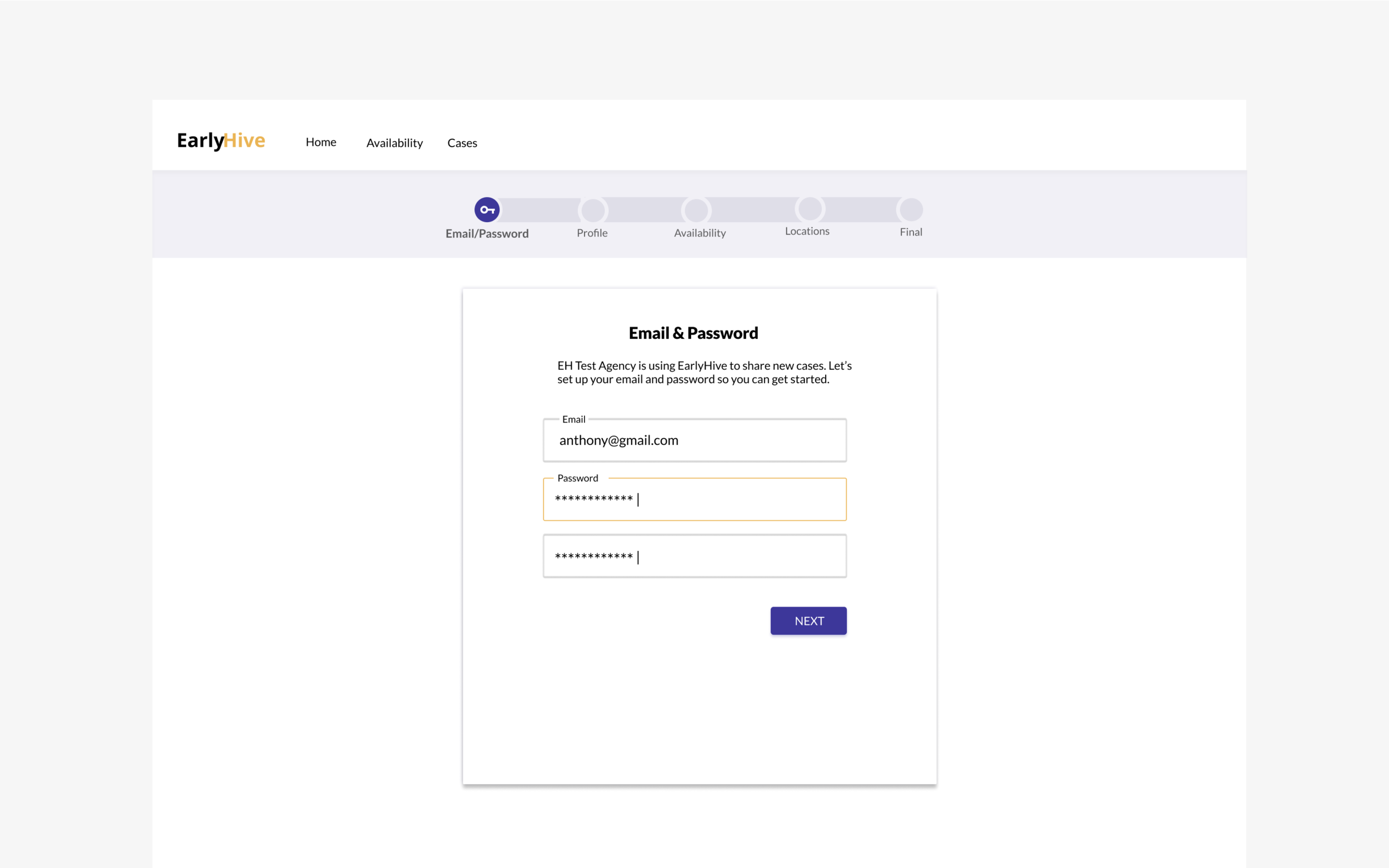
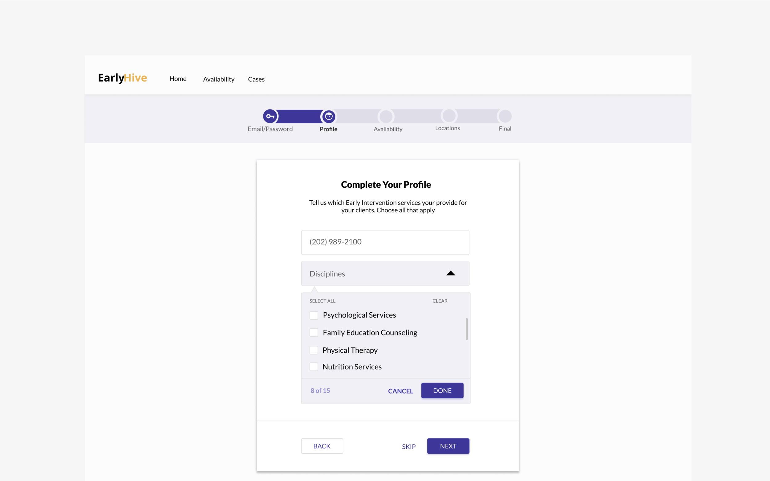
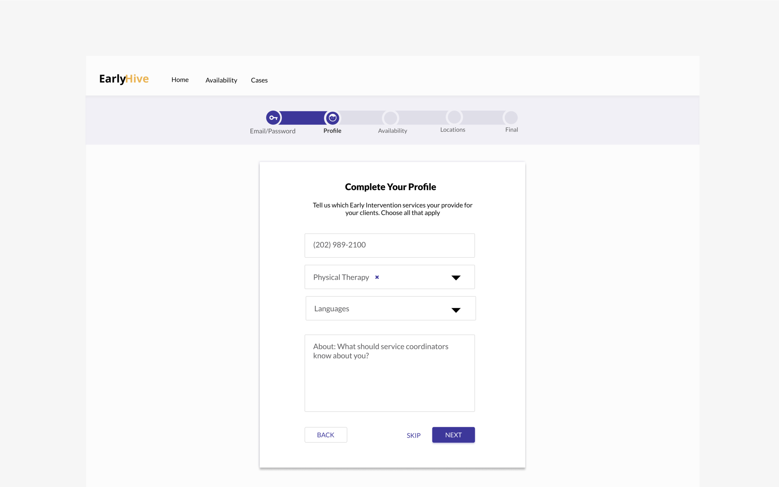
The initial site created by their engineer was very rudimentary, and the founders noted that agency workers had trouble with accomplishing the most basic onboarding task.
We went through each stage of the UX process, and we narrowed our focus to the most essential experiences and interactions needed to flow for all parties, while meeting user and business goals.
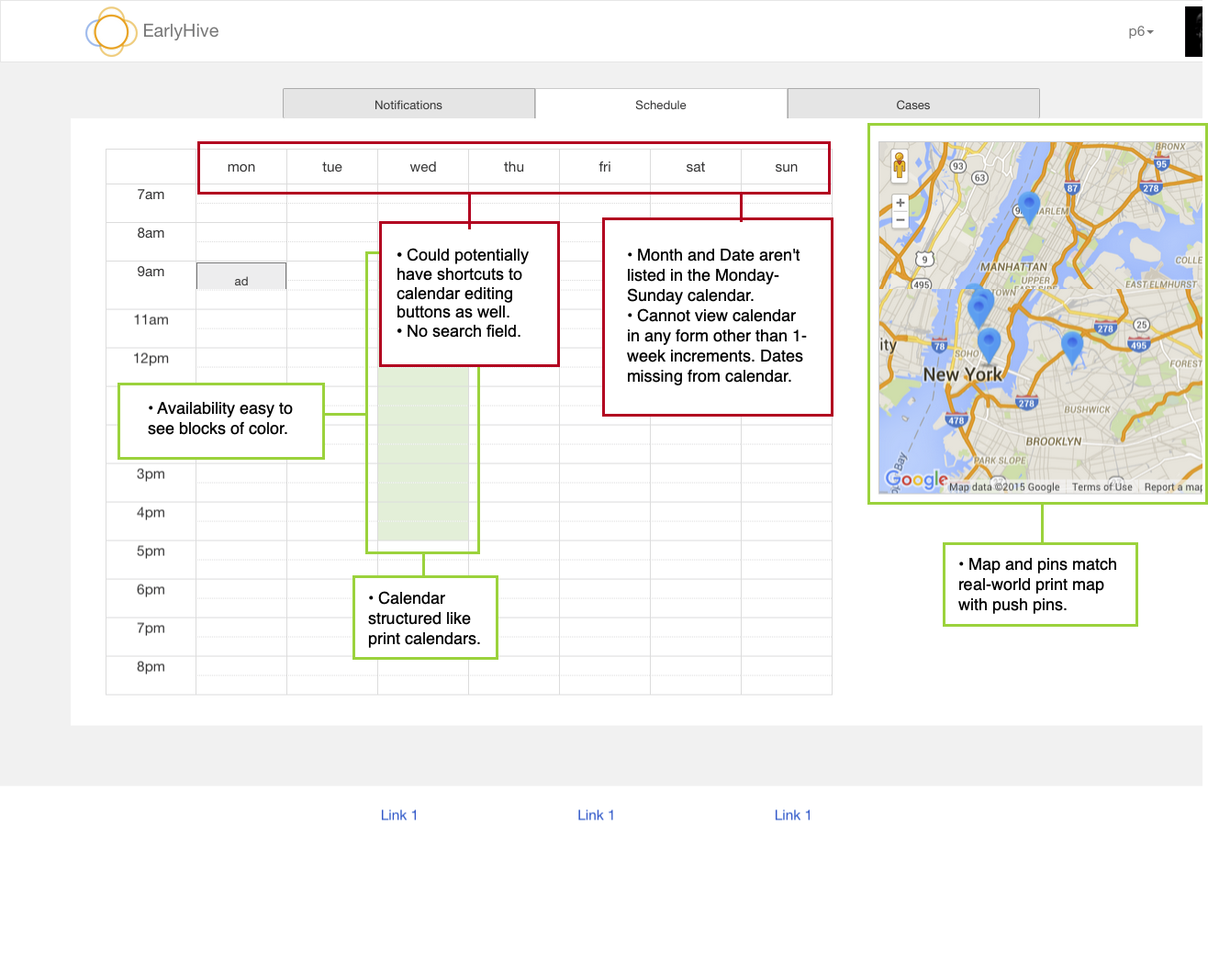
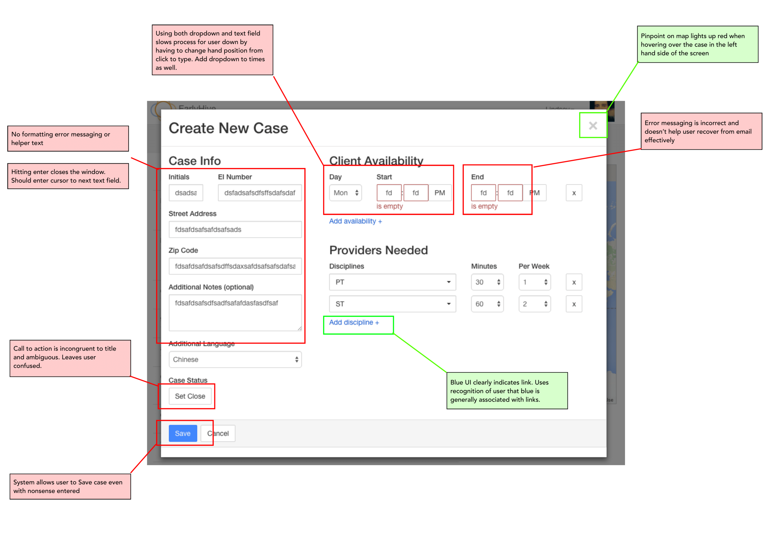
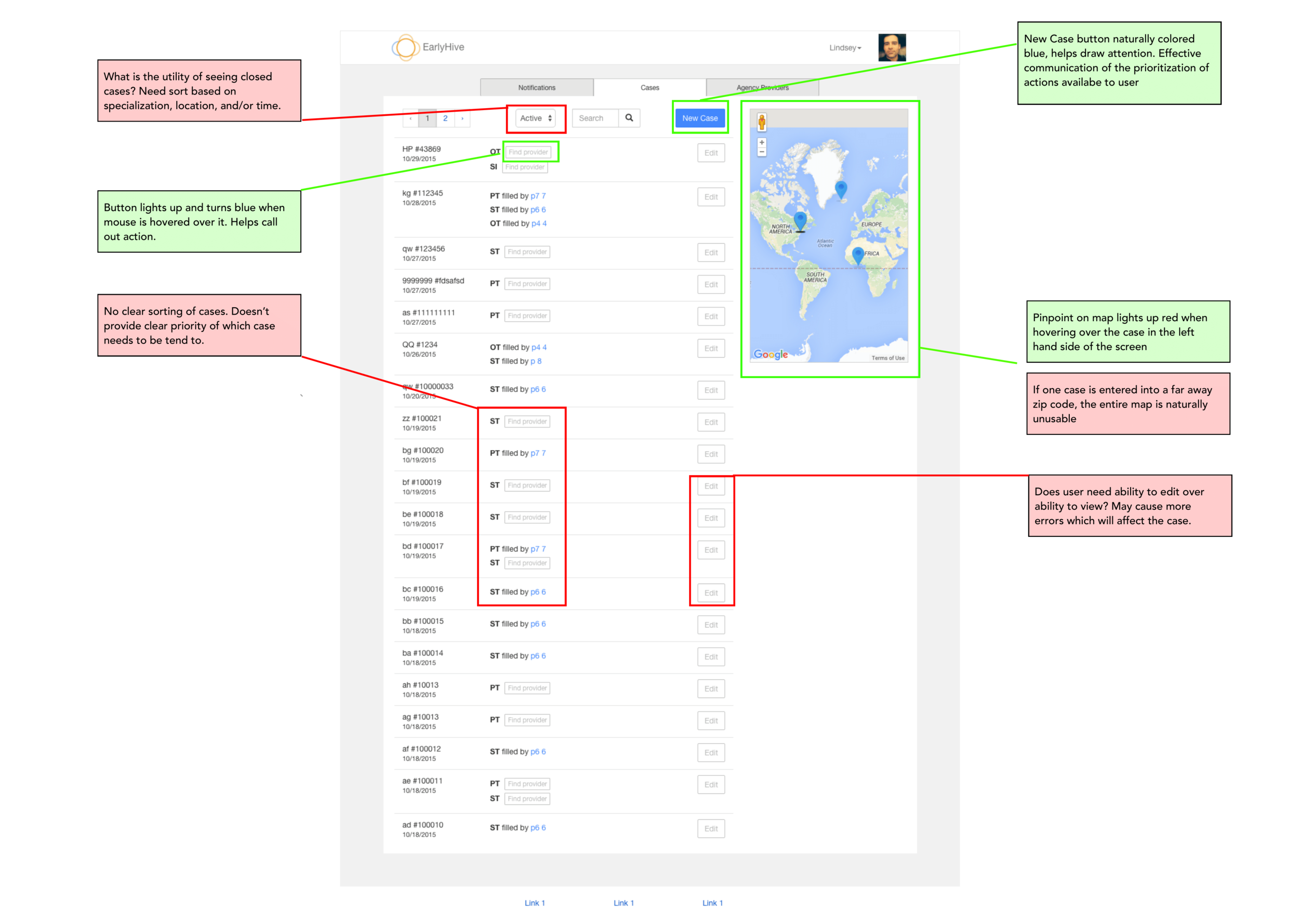
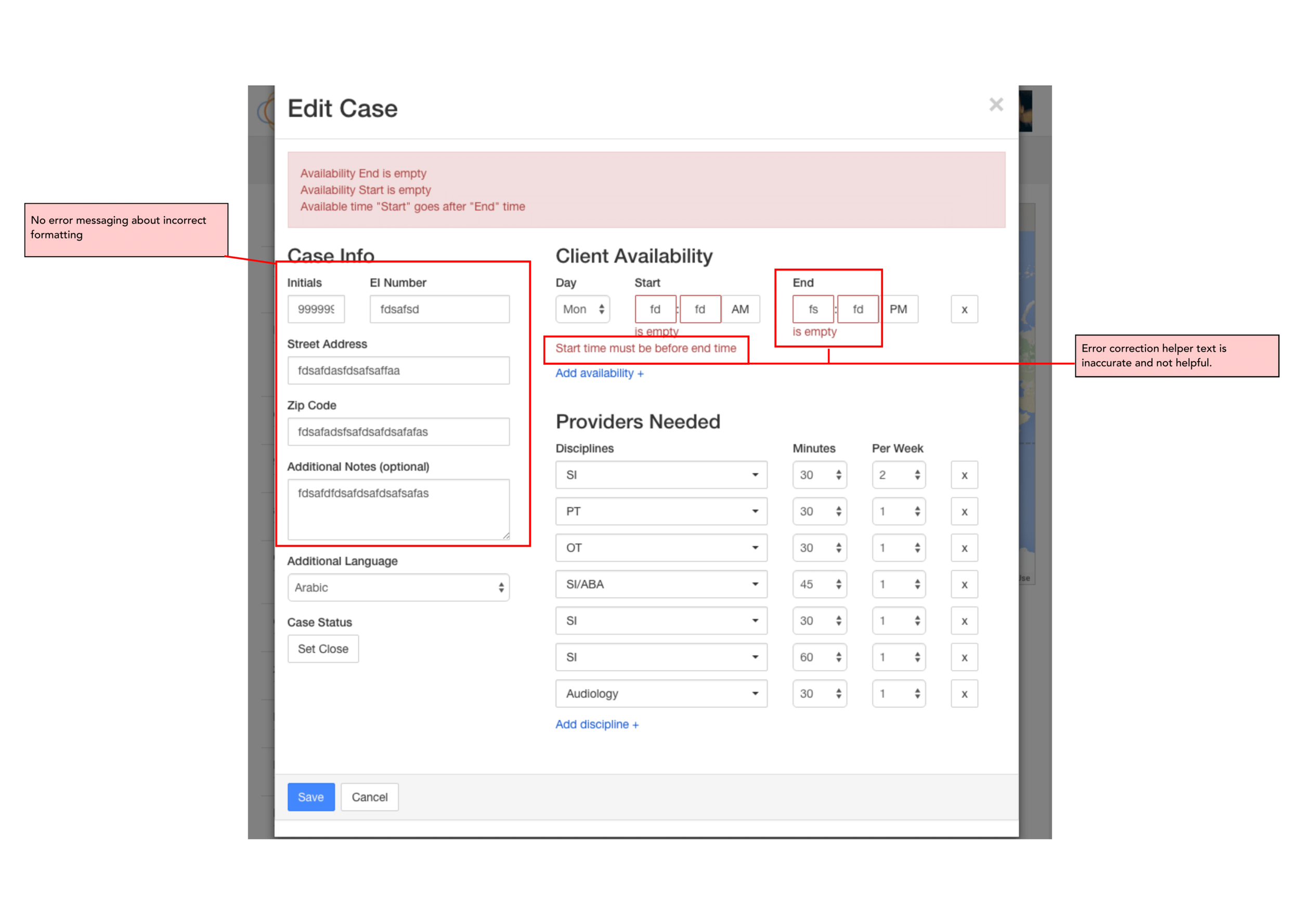
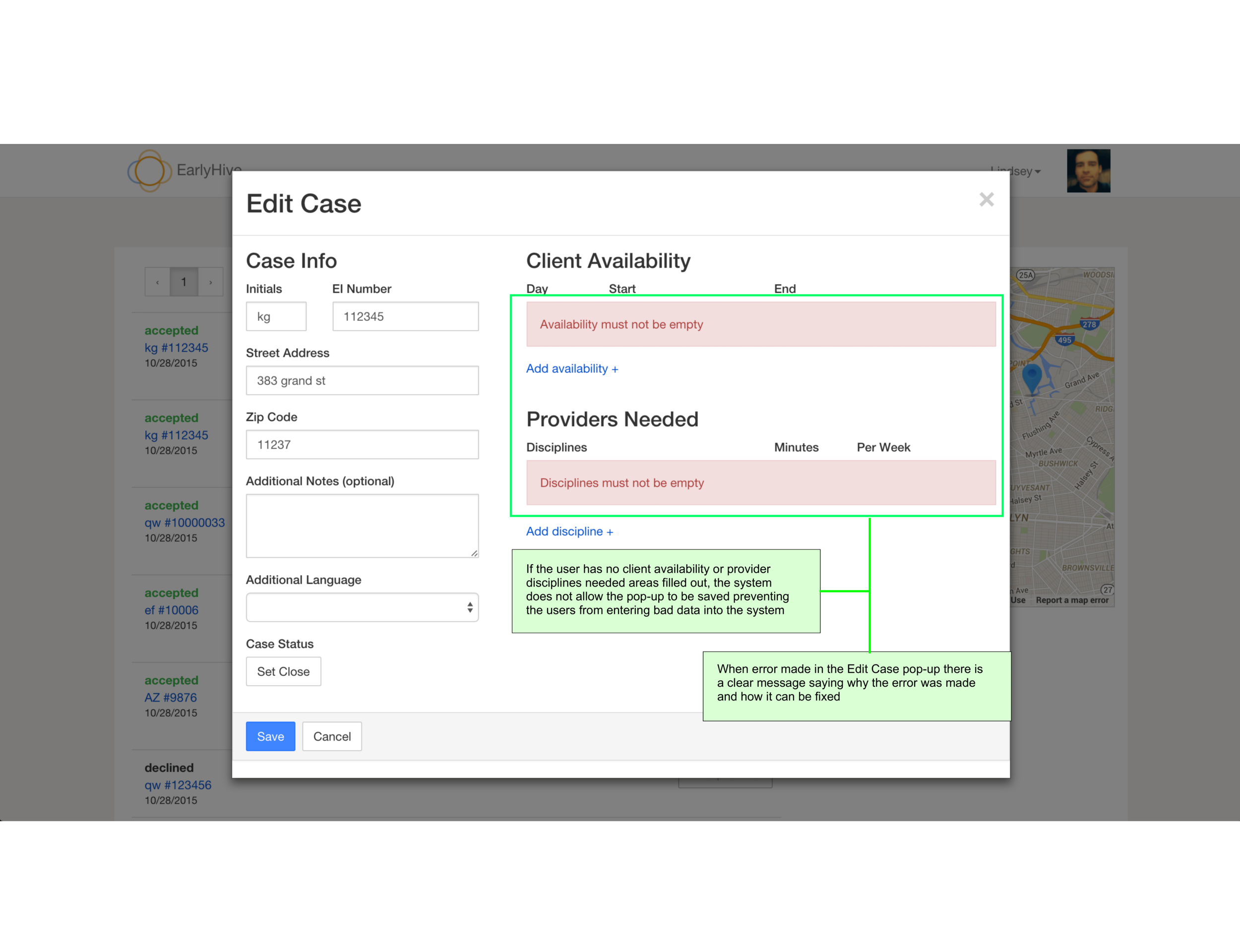
Usability Heuristics Analysis
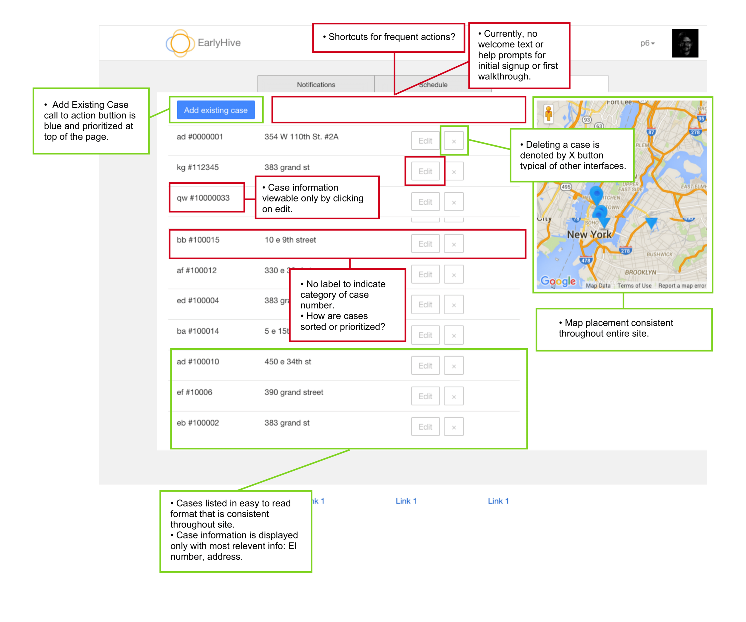
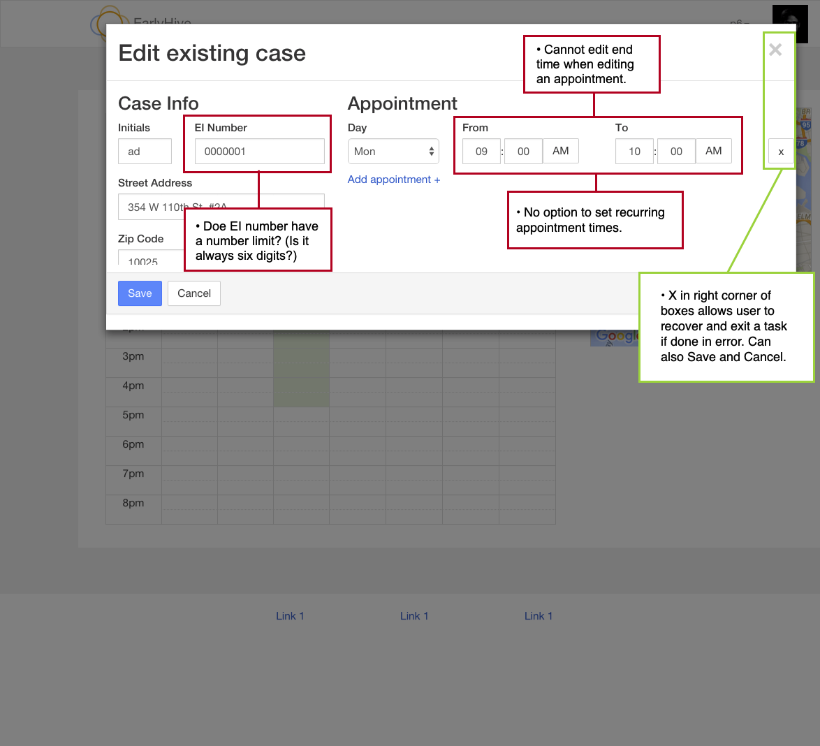
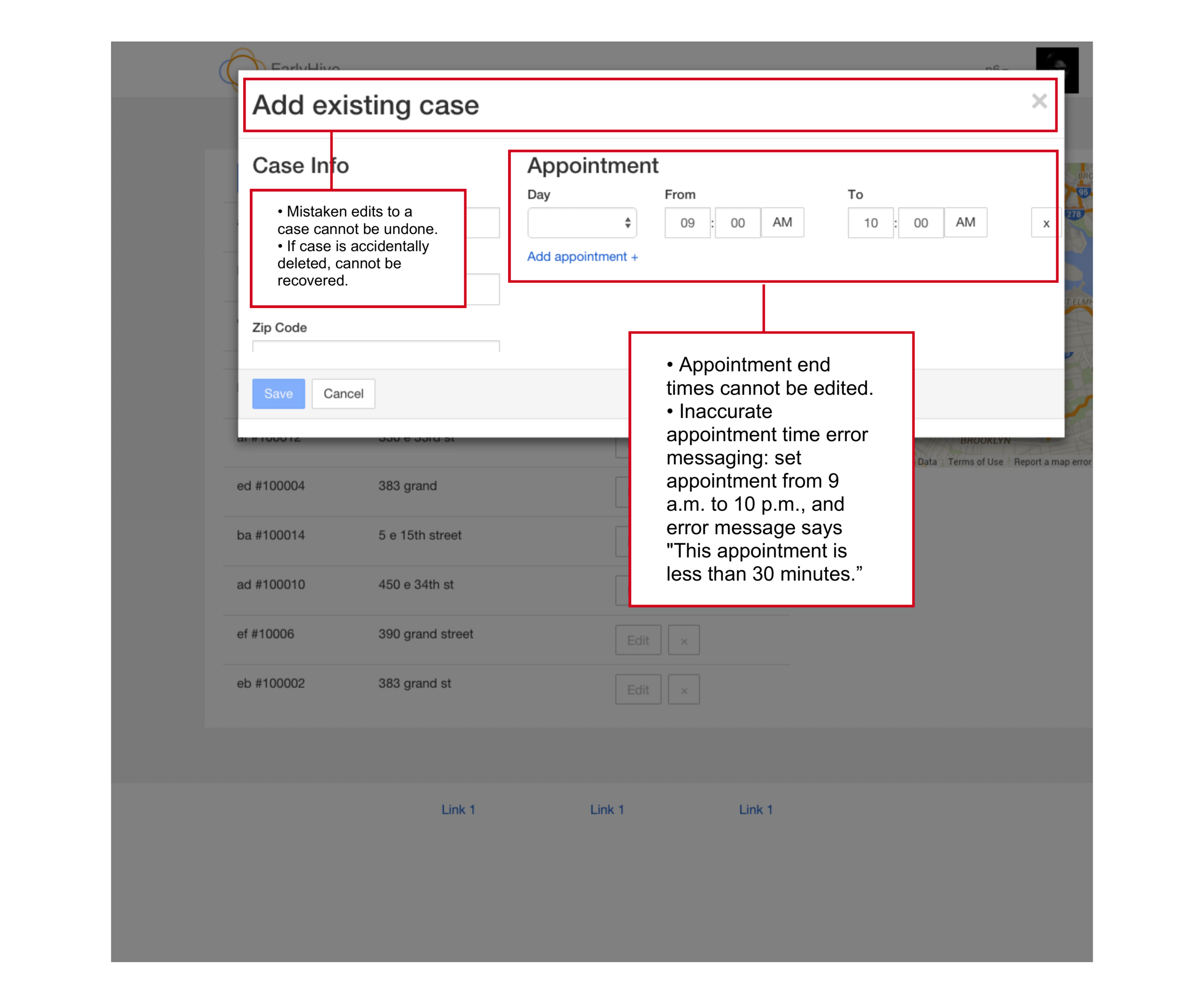
My first step was to do an audit of their first prototype based on usability heuristics by by Norman-Nielsen group. We showed them which features and user flows are working well and what could improve.
Findings:
The platform is confusing for users and lacks appropriate help text. After login, one cannot immediately view the most pertinent information.
When providers log into the system, the landing page (Cases) didn’t have the most pertinent information a user needs to know.
User errors and subsequent recovery is unclear and very confusing.
Cases in need of provider’s response are not located at top of page; also, cases cannot be sorted.
Google Maps feature provides excellent visualization of case locations and greatly improves overall user experience.
User Interviews & Research
Interviews
In total, we interviewed 3 providers and 3 coordinators, and recorded screen interactions and audio of each test. We wanted to find out more about their workdays and how they go about navigating the current Early Interventions Services ecosystem. We want to find those pain points, and moments of delight.
For the Coordinators, we asked:
Can you tell me about a typical day in your job? What is the process you take to add a case? What are the main details you enter while making a new case? How do you find a provider? What are some pain points in these processes? What are some different status stages in the process? How do you keep a tab on the status of all the open cases you’re handling?
For the Providers, we asked:
Can you tell me about a typical day in your job? What kind of patients do you treat? How do you decide which areas to service in NYC? How long do your appointments typically last How do you schedule your cases / appointments What do you like/dislike about scheduling? Can you please tell us more? What is your motivation behind choosing this field? (pleasure) In terms of managing and scheduling cases, what are your biggest challenges? (pain points) What do you currently use to stay on top of your appointments? (context)
Once they completed the interview portion, we had them do a task-based test and we recorded their feedback about the ease of use with the prototype.
Usability Testing
Tasks for coordinators:
• Find a provider in a desired area and time
• Add a case
Results:
• Users struggled to find the search feature
• System status updates were inadequate, meaning coordinators weren’t certain they had successfully sent a request for a provider to accept a case.
Tasks for providers:
• Accept/Decline a case
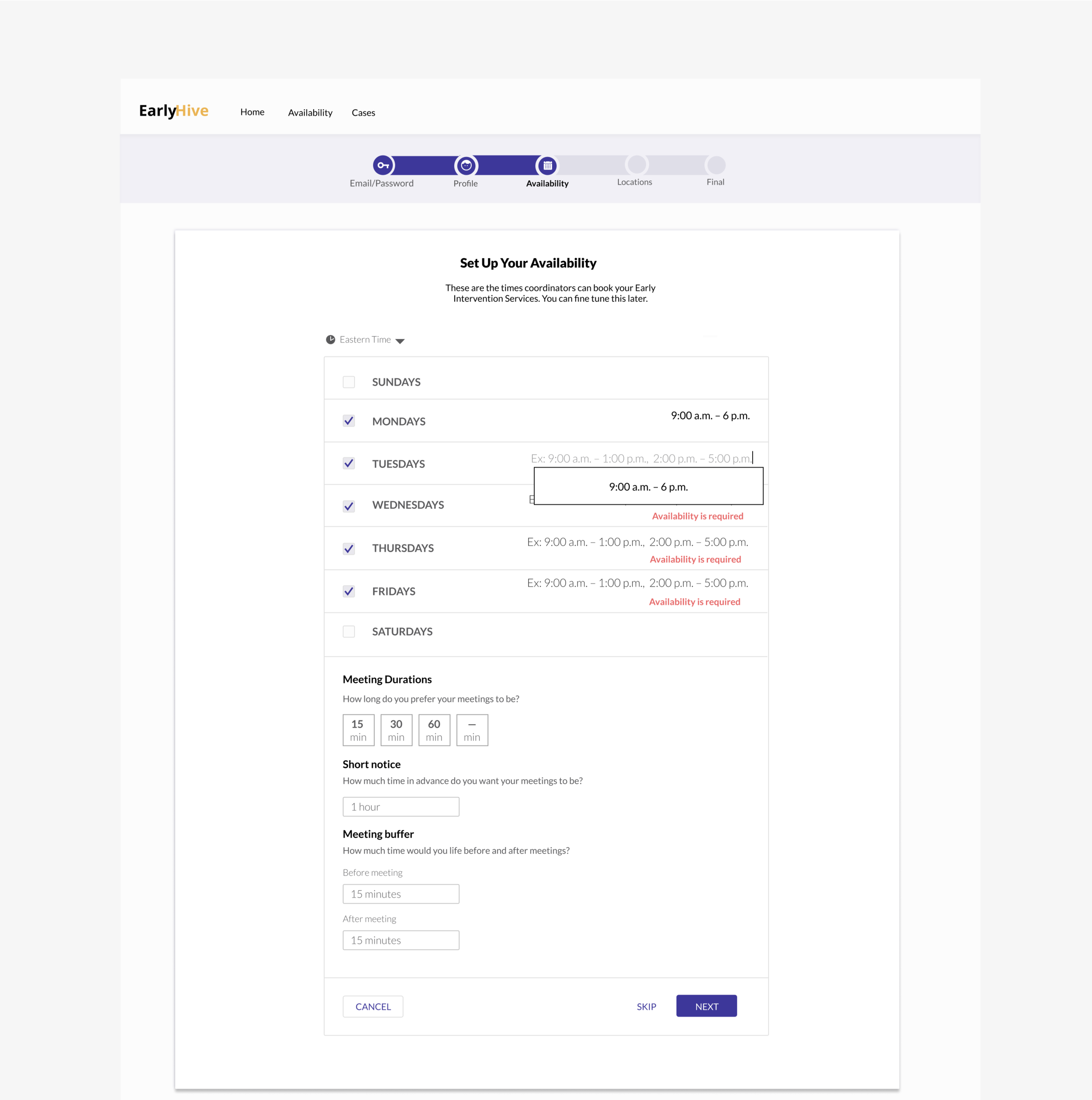
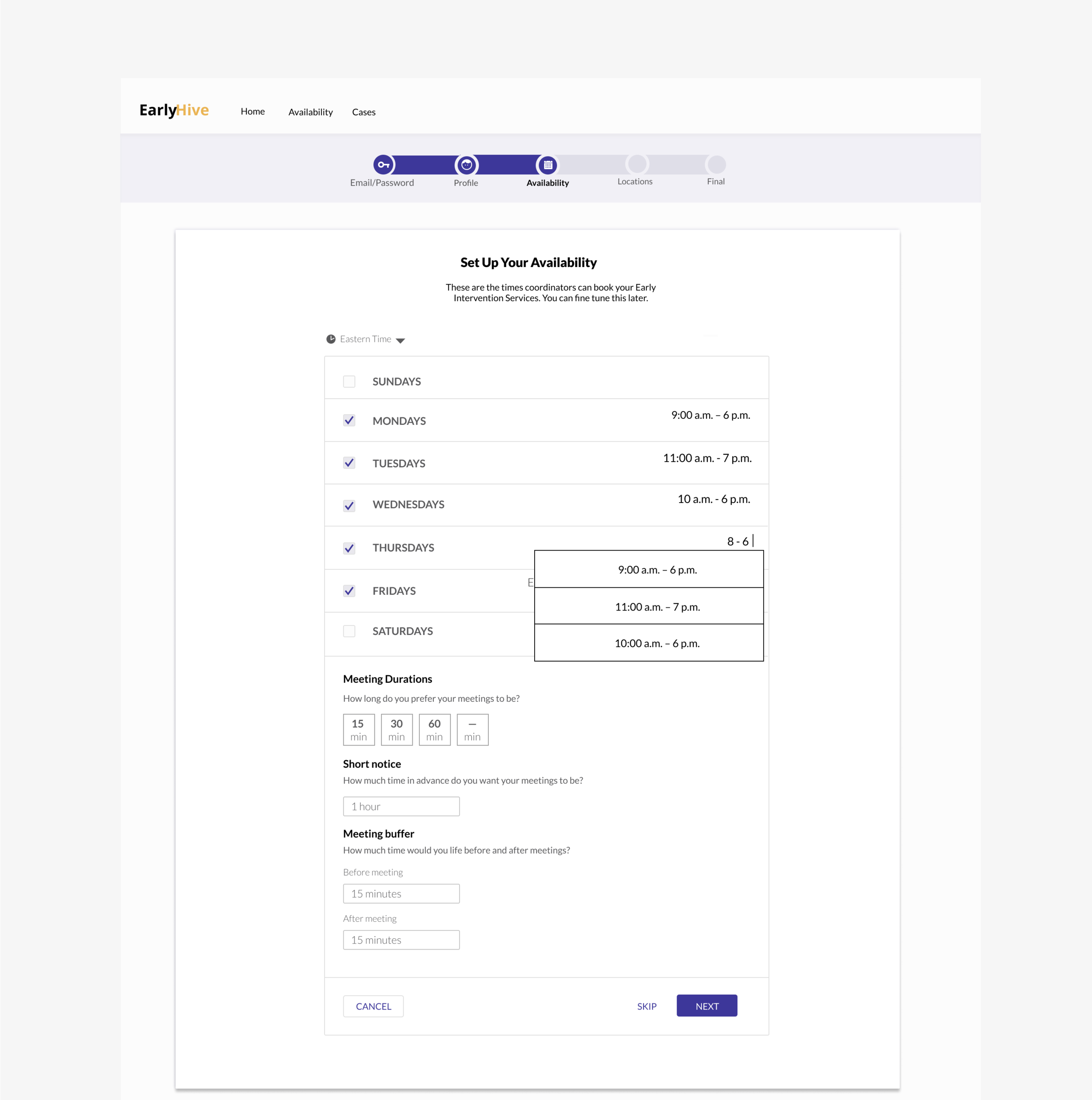
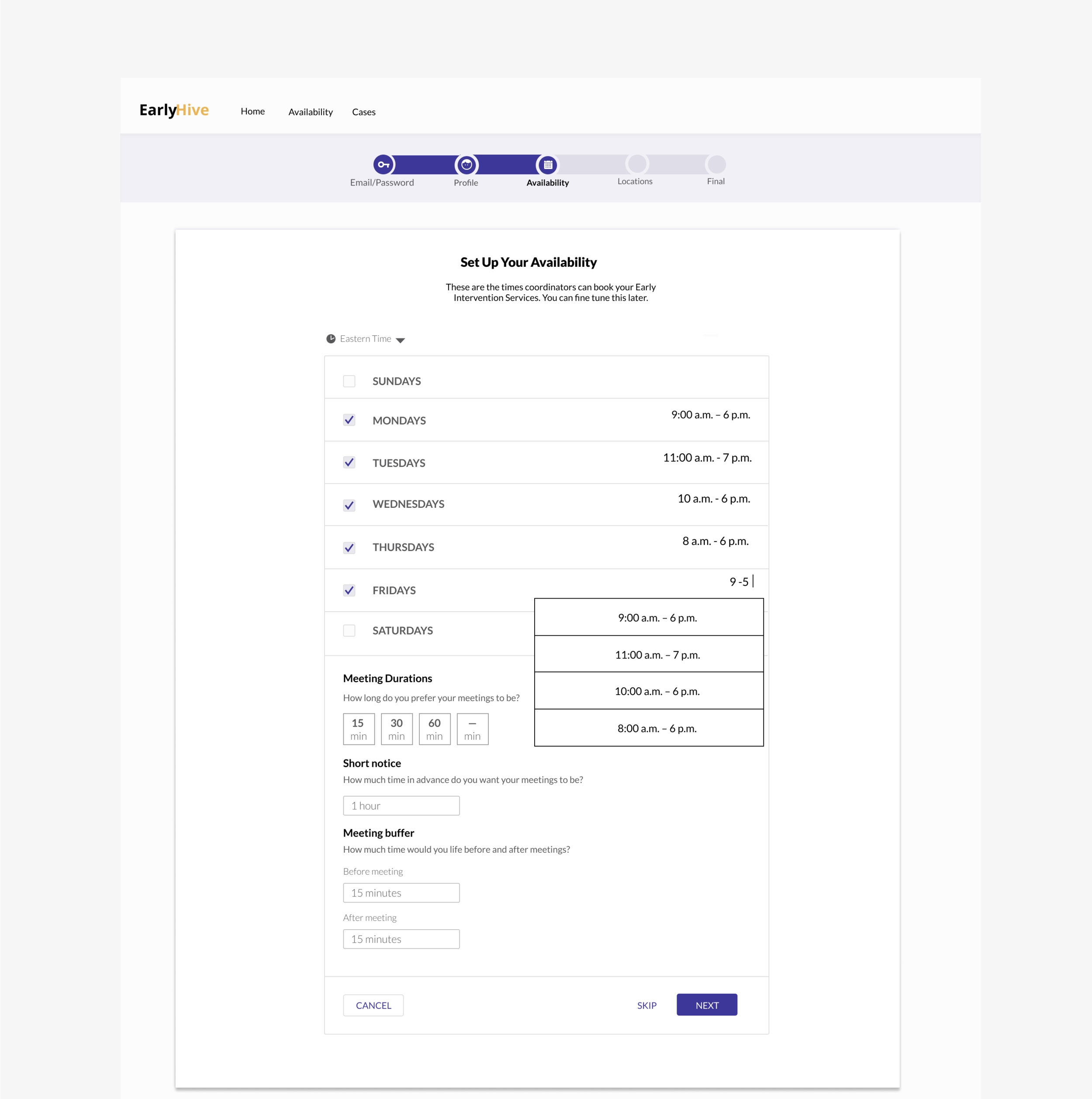
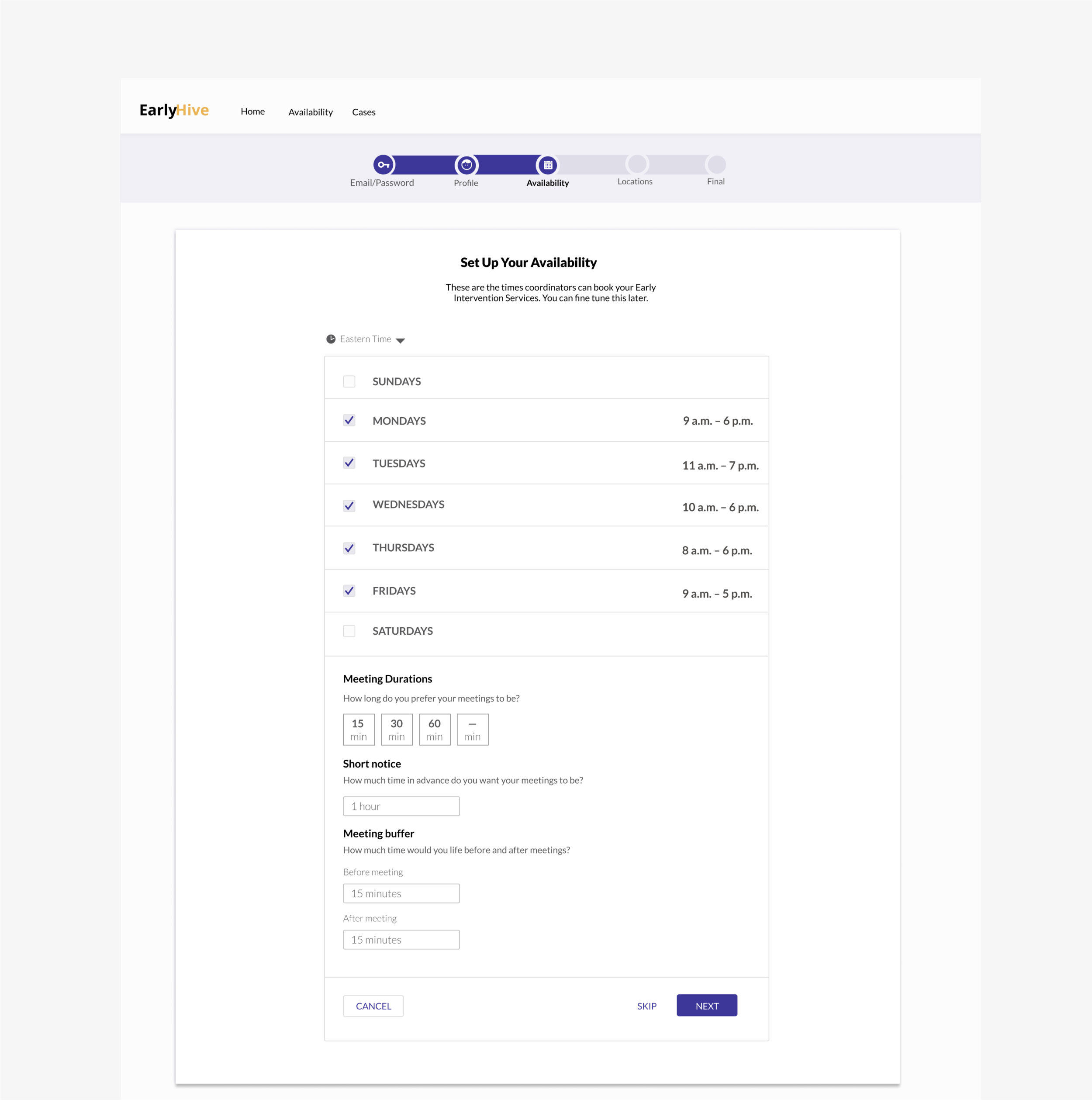
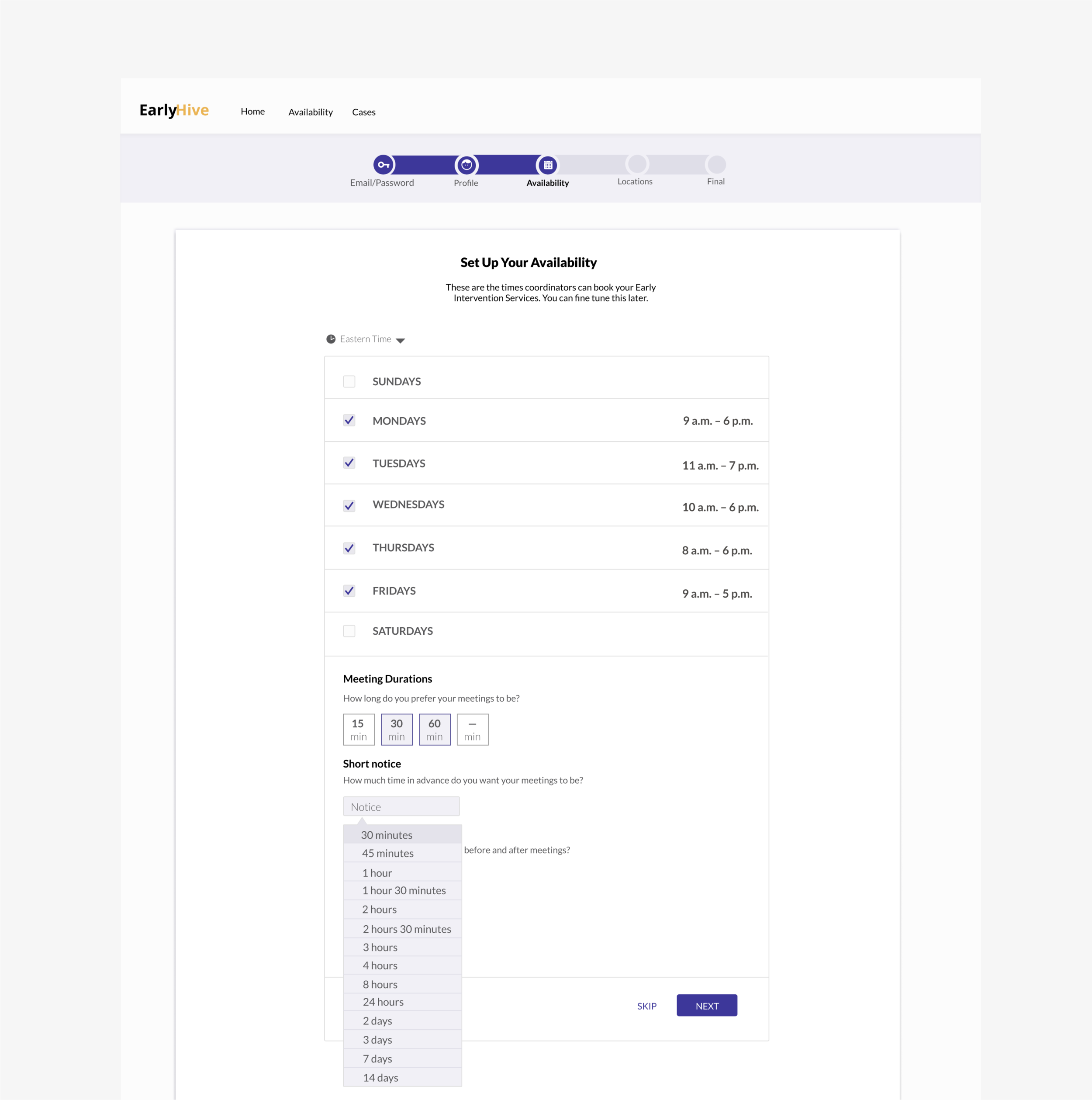
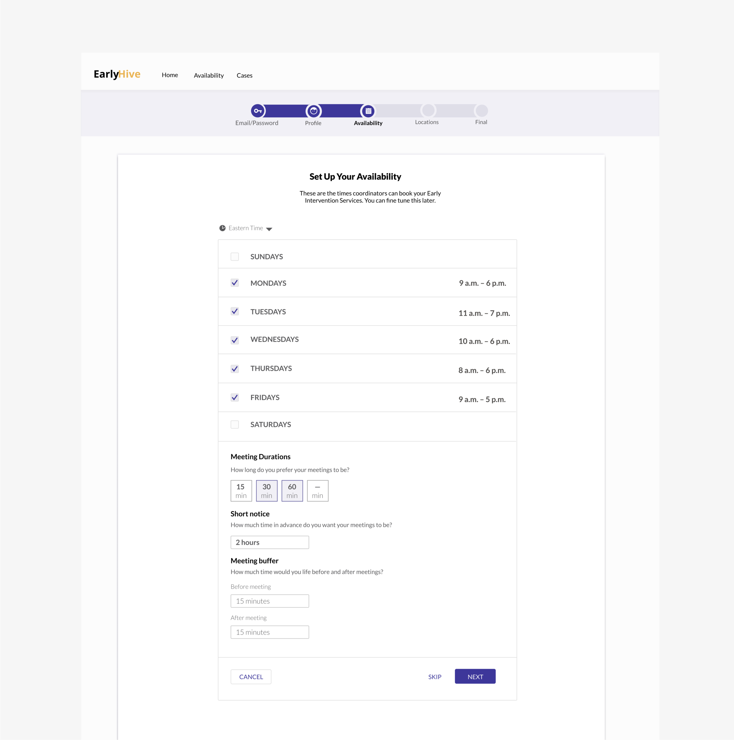
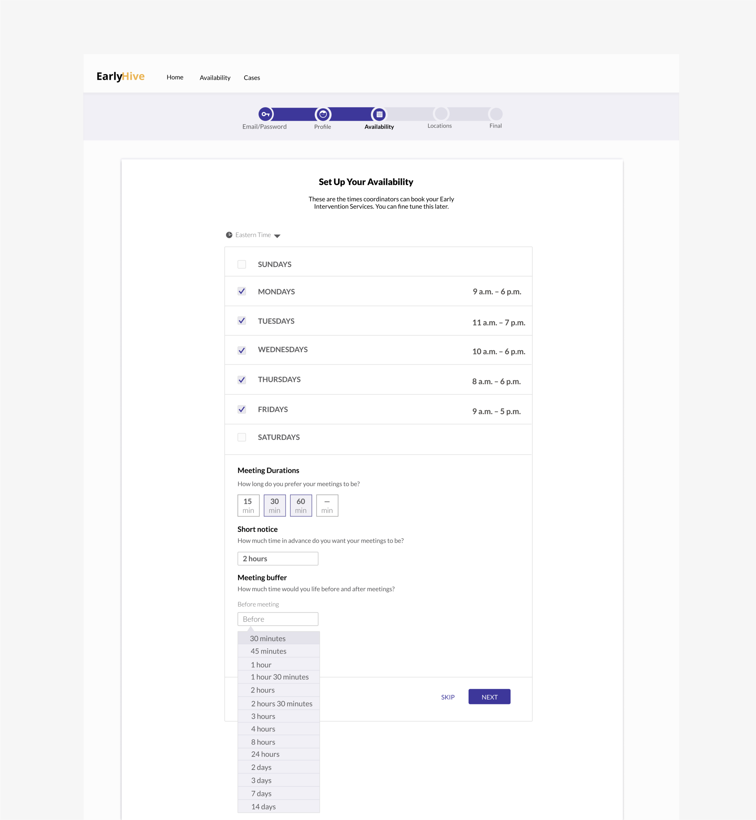
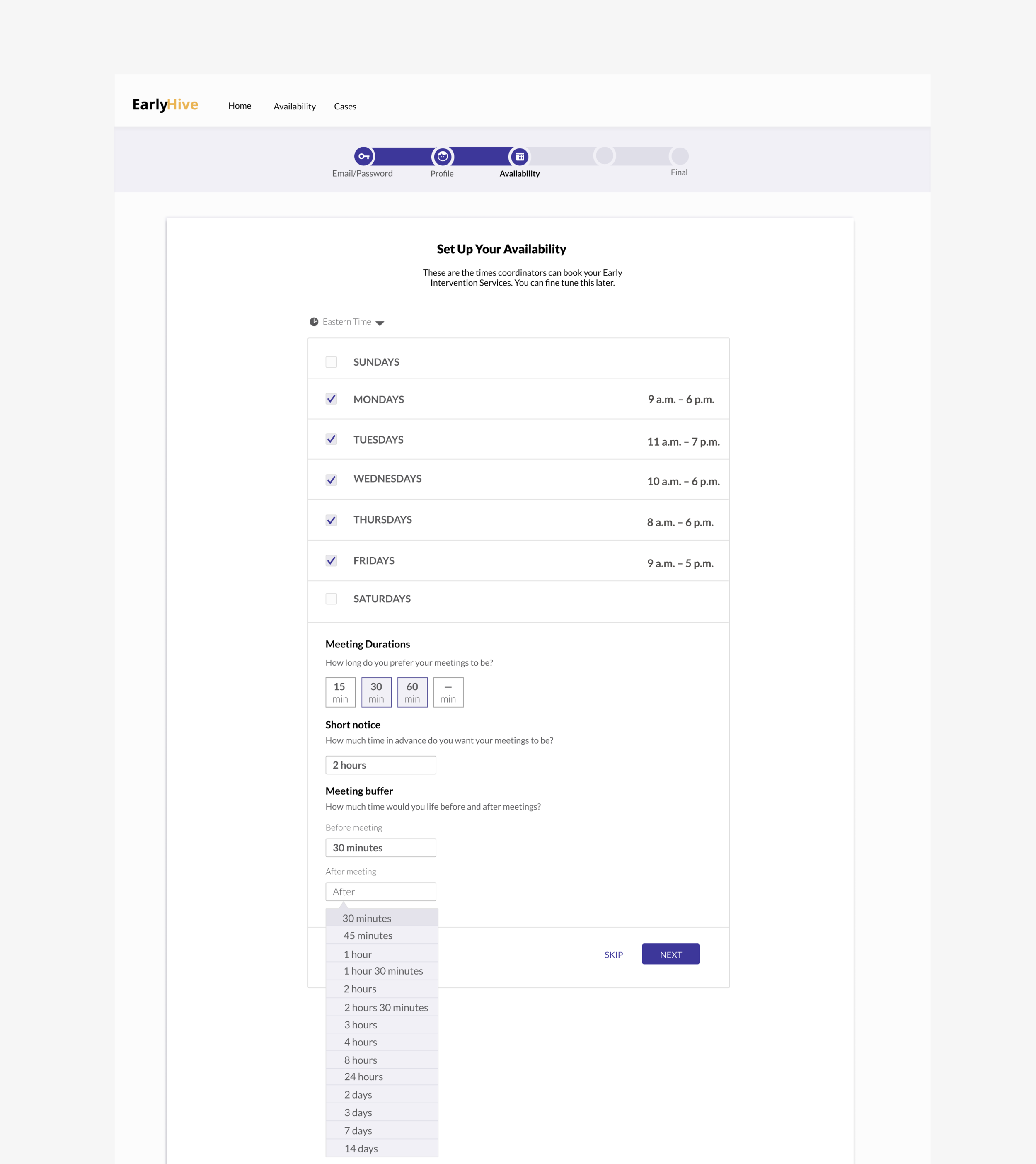
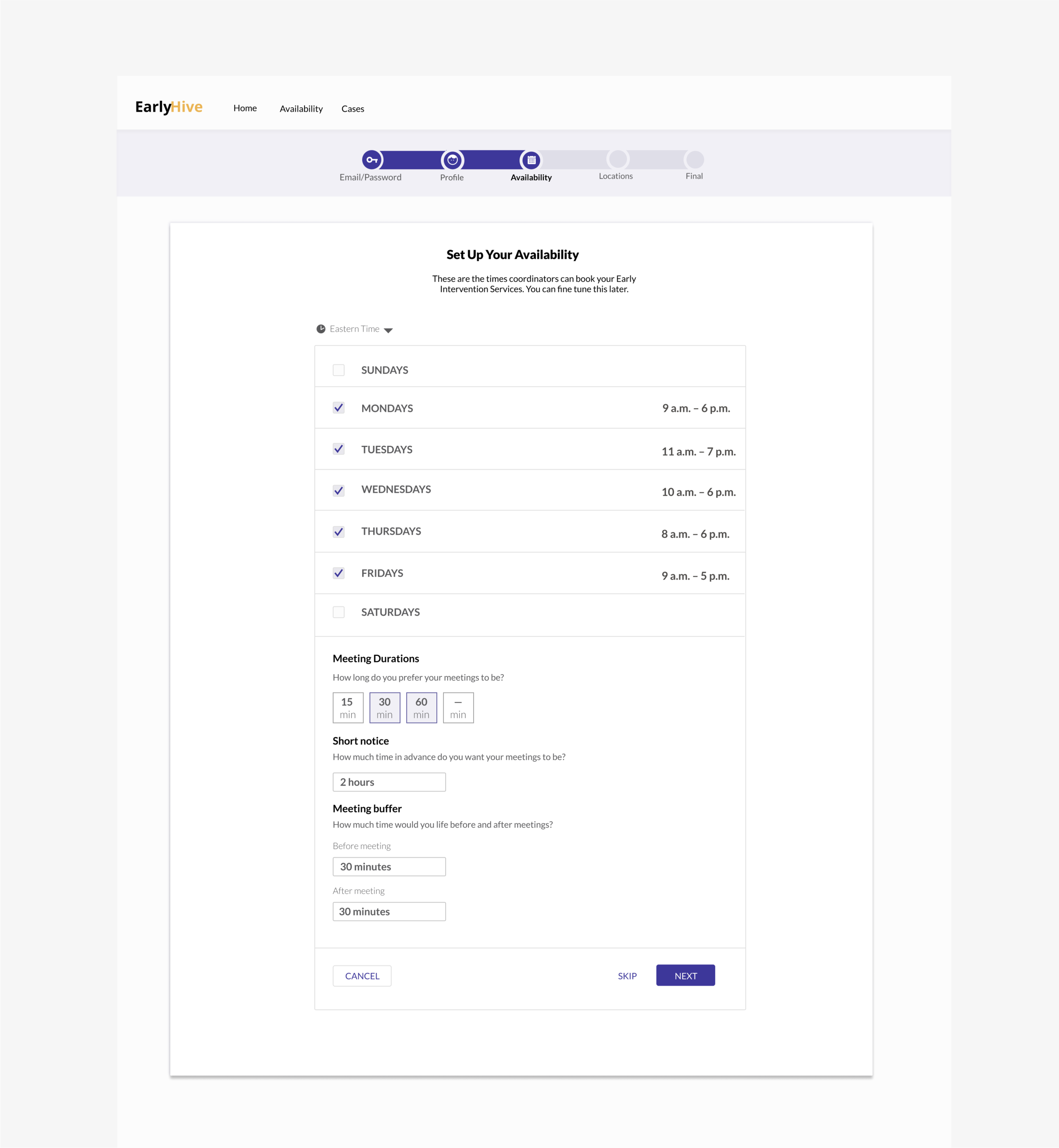
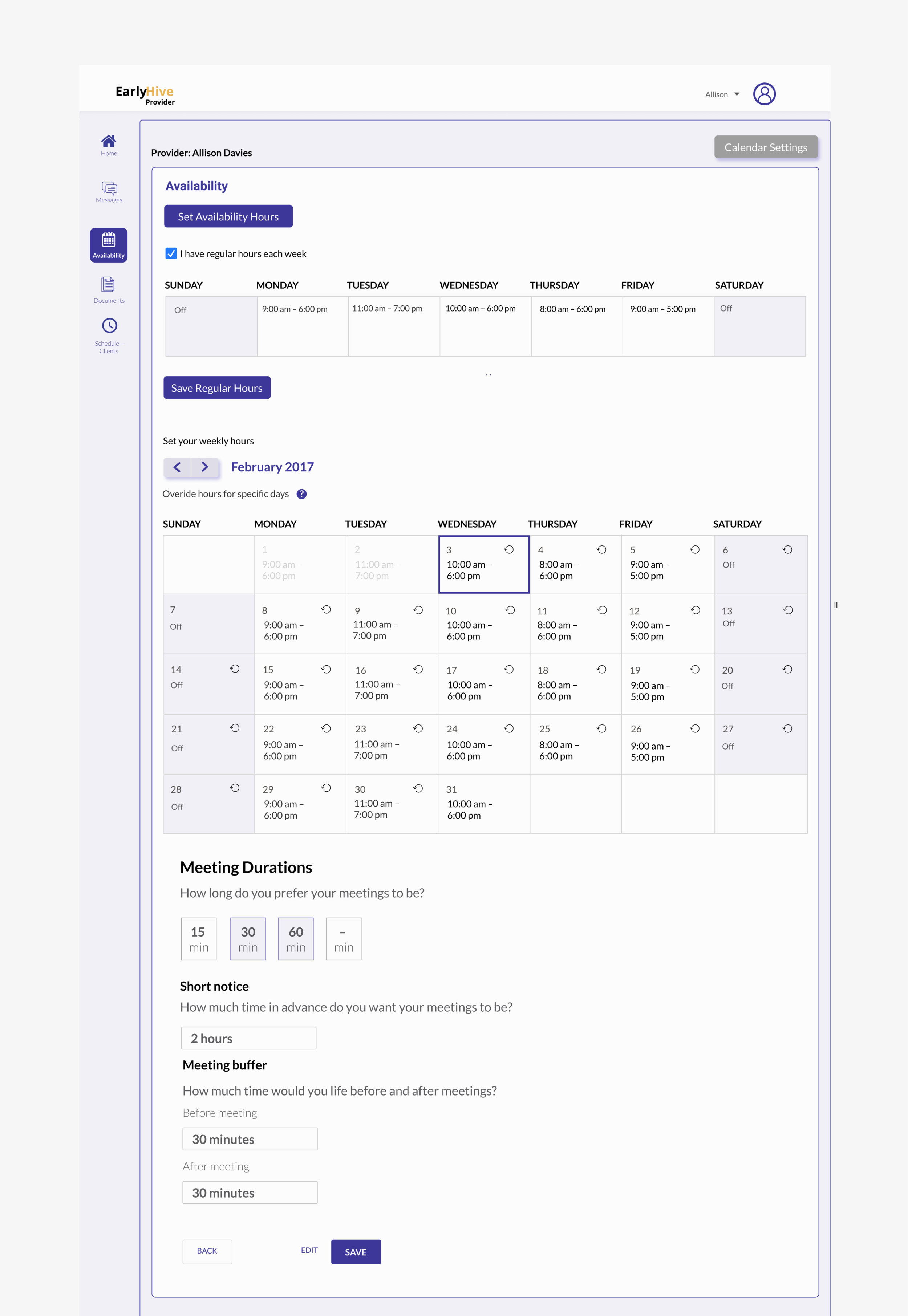
• Enter schedule availability
Results:
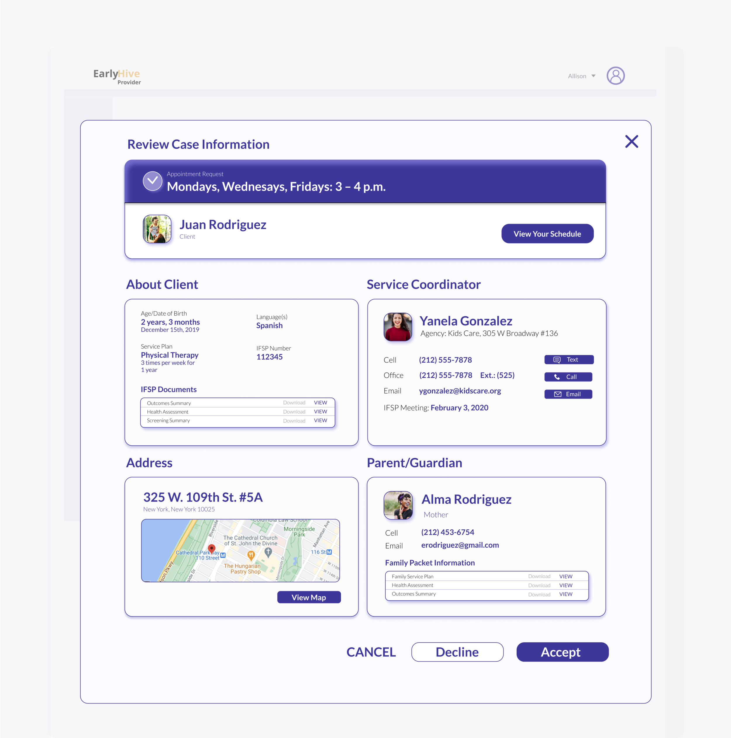
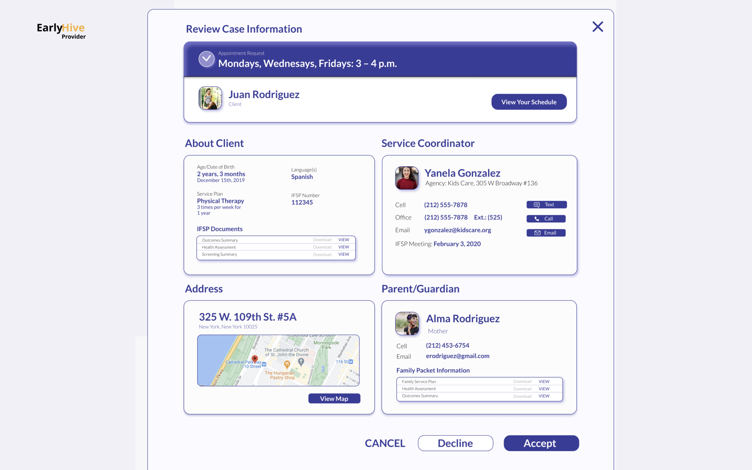
• Providers wanted more detailed information about a particular case before accepting
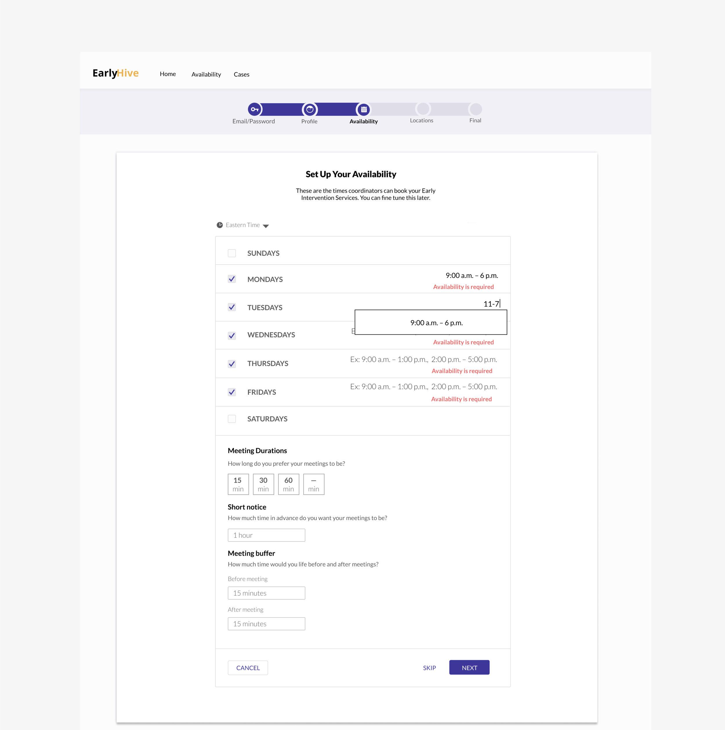
• Need scheduling features to be more flexible, for rescheduling, etc.
Initial Takeaways:
We found two main interactions between coordinators and providers are Case Search and Servicing a Case. Both parties were motivated to solve this pain point because it wasn't currently addressed in their New York state provided software.
Here the design team conducted usability tests of our prototype with one of our primary user types, a provider. I took notes of what I observed of user behavior and asked questions.
I noted all the challenges faced by the provider and understood what the user experience was like for each person we interviewed.
Affinity Mapping
Interview Synthesis
INTERVIEW THEMES
When using the platform, providers needed to able to quickly search for cases in close proximity and time of day/week. They also needed to be able to enter notes for each child’s sessions so that case coordinators could stay up-to-date in managing heavy case loads.
Pain Points:
1.) Cumbersome search process and excessive phone calls
Agency service coordinator must contact dozens of providers before a case is successfully staffed.
2.) Factors for finding right provider:
specialty
proximity to client
provider’s availability matches child’s availability.
3.) Communication barriers
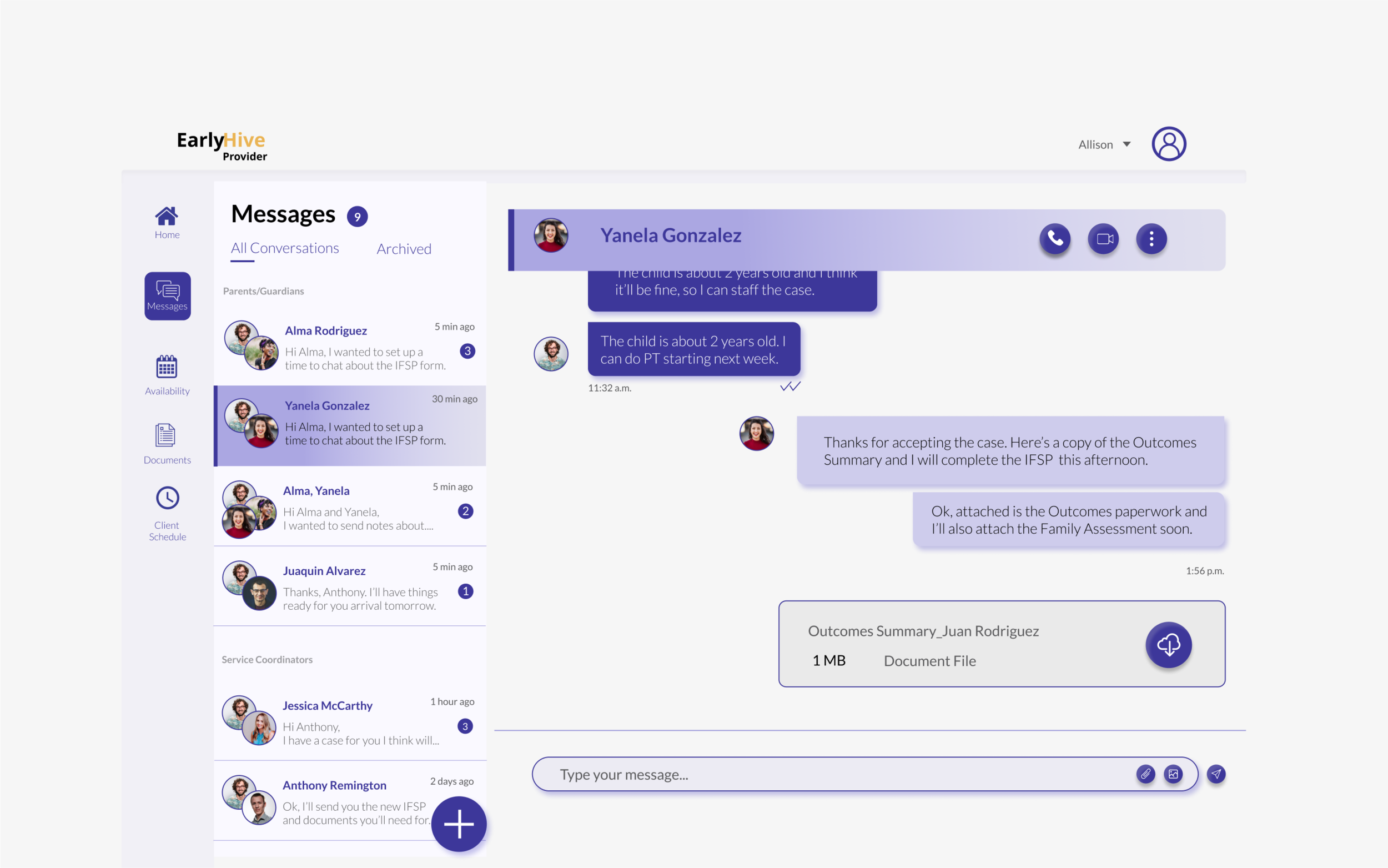
Once a case is accepted, providers have no system to communicate updates to a coordinator in real time.
4.) Lack of community
Personas
Feature Prioritization
Feature prioritization MVP:
Search and Filtering: Enables case coordinator to search for a specific provider. Features allows search by name or from a list of qualifications (i.e. providers in a certain zipcode, their specialty, etc.).
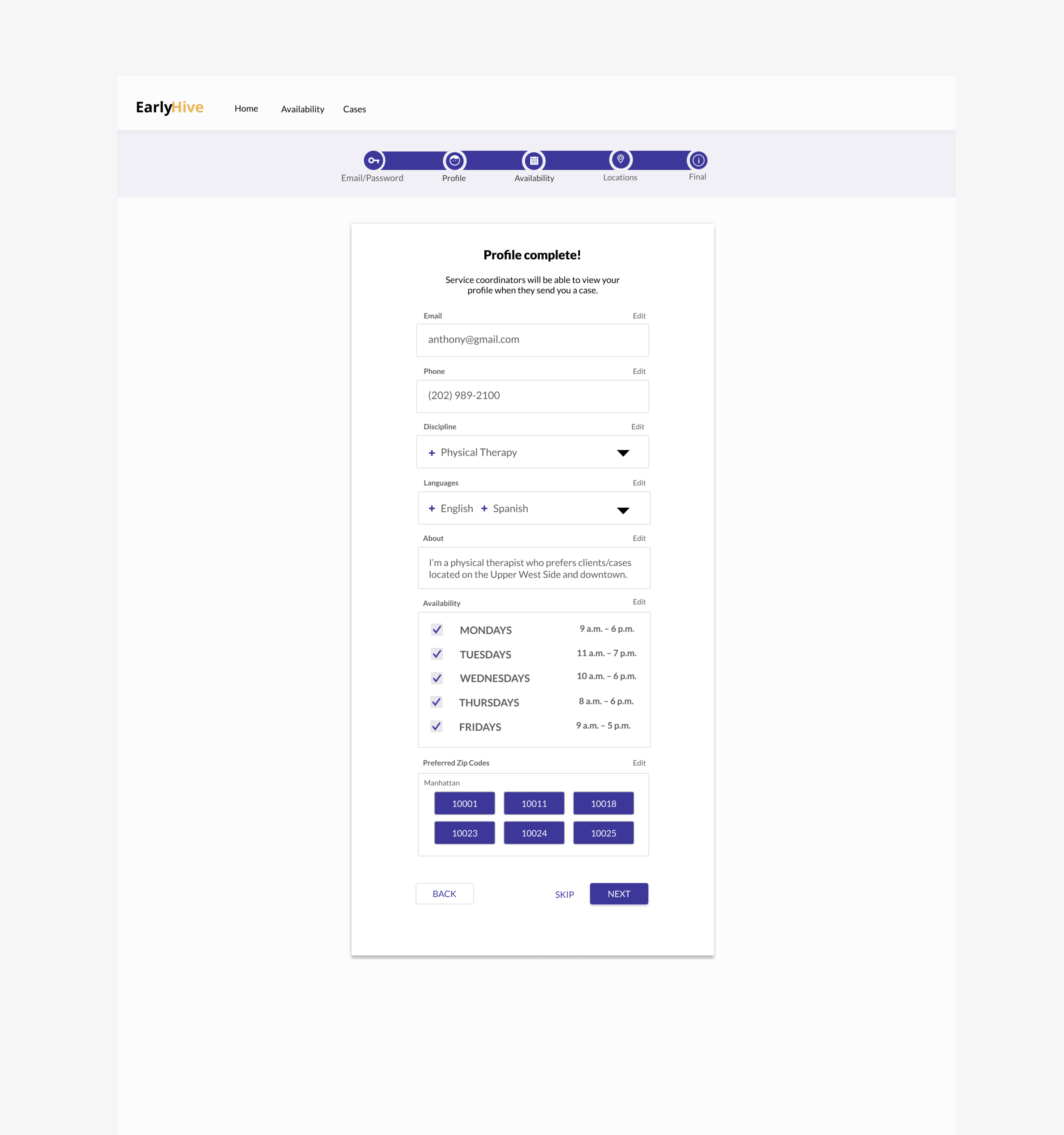
Contact Information: Providers can find all their clients’ contact information once the provider accepts a case, and service coordinators can access providers’ information for each case.
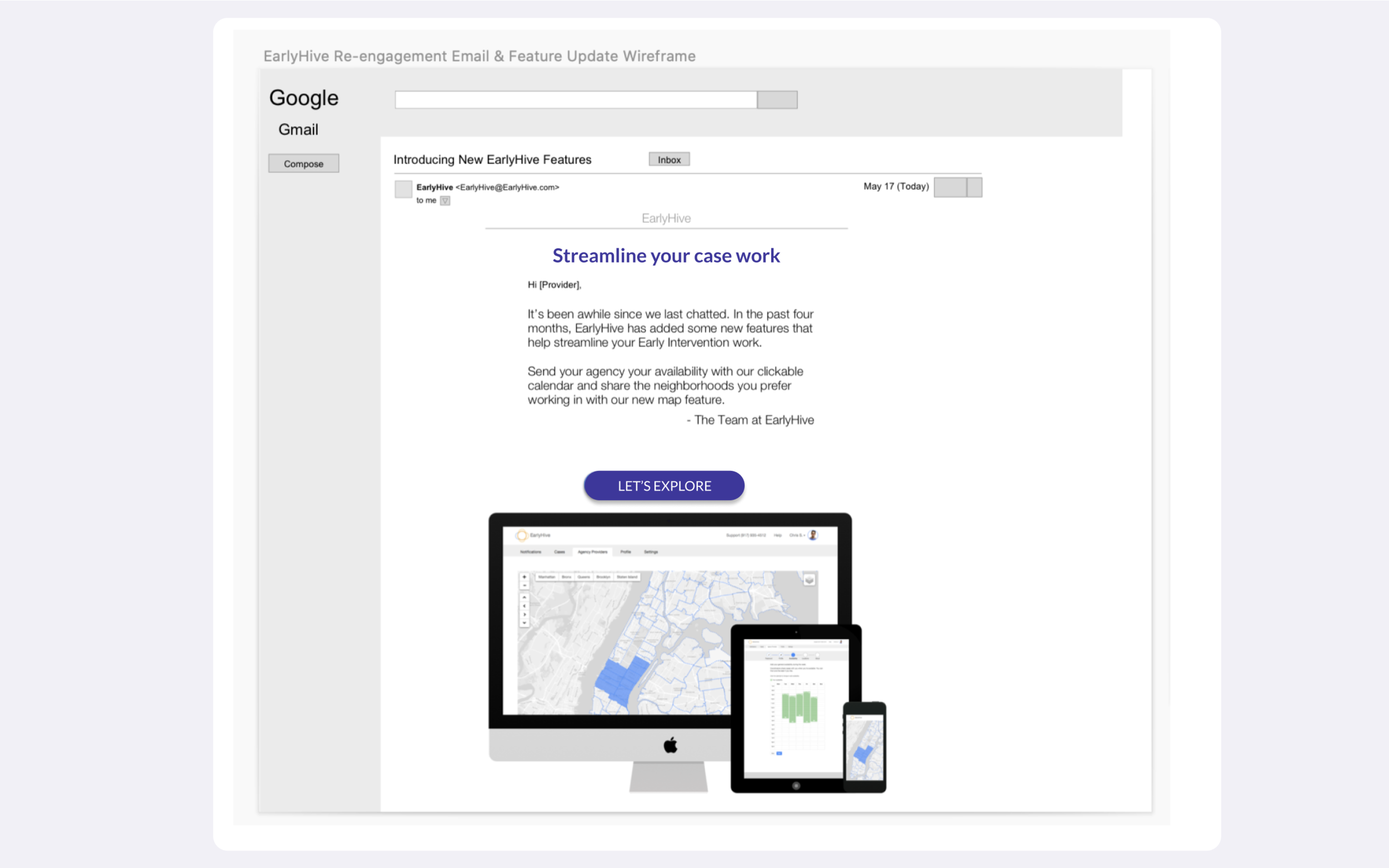
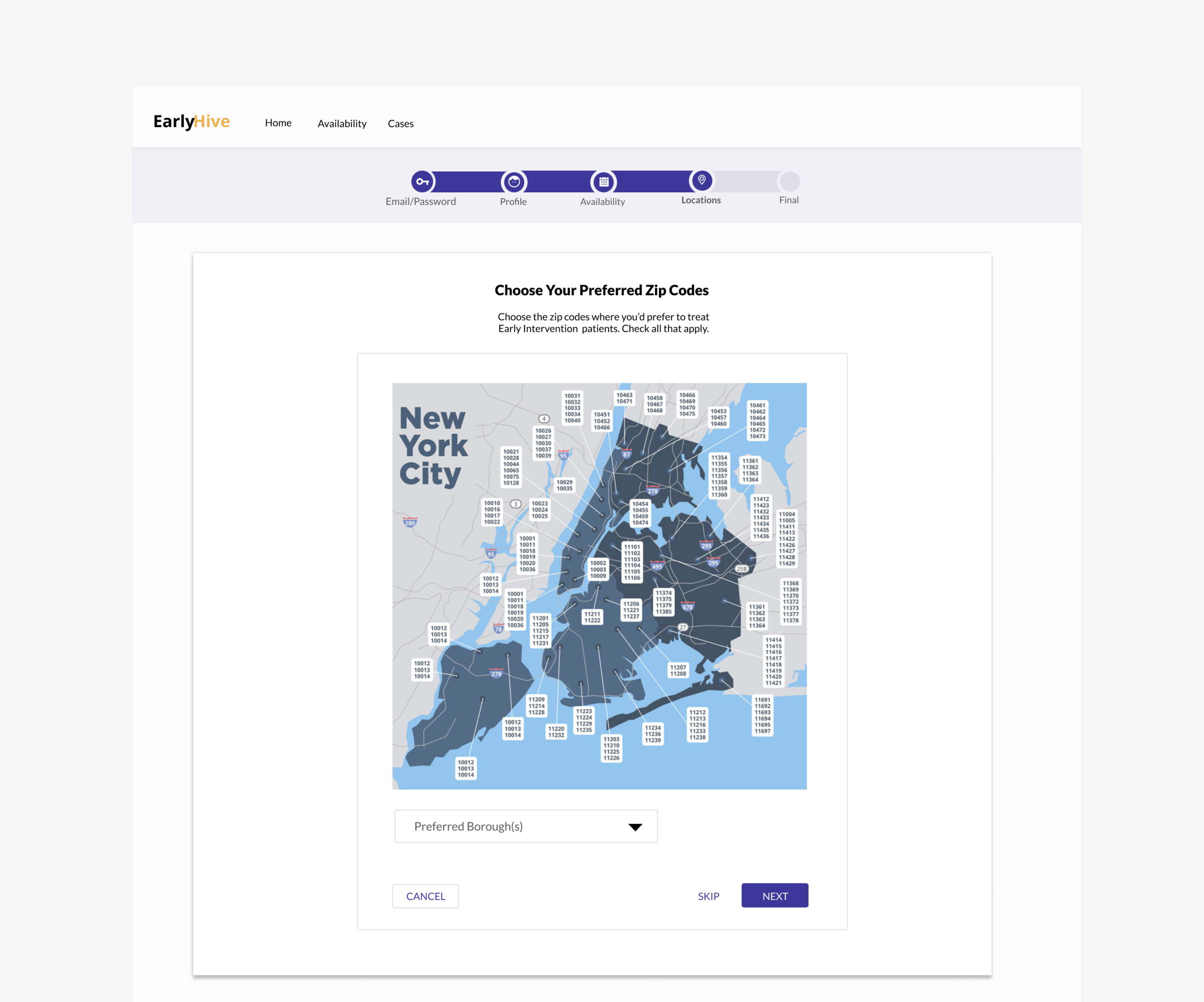
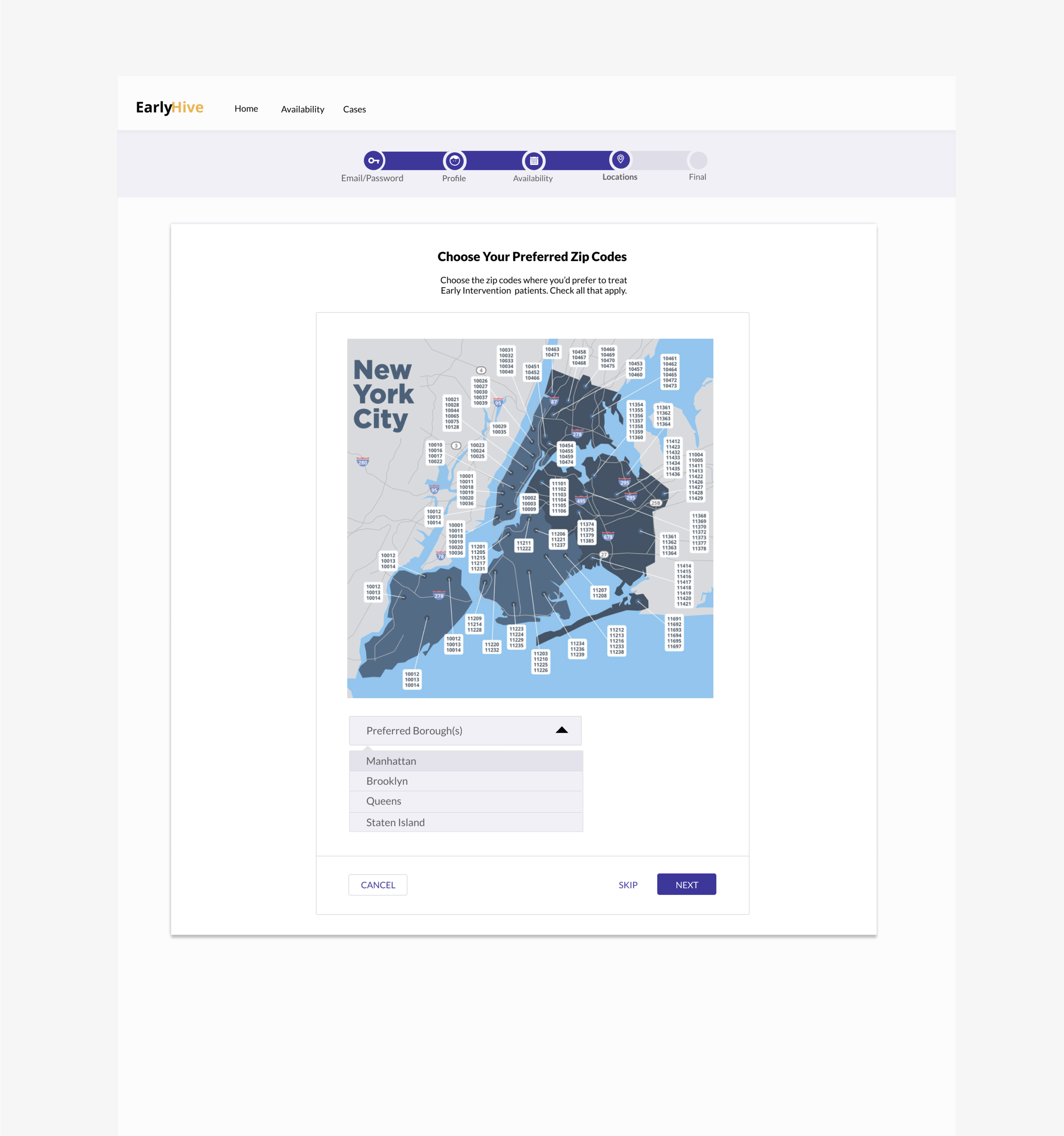
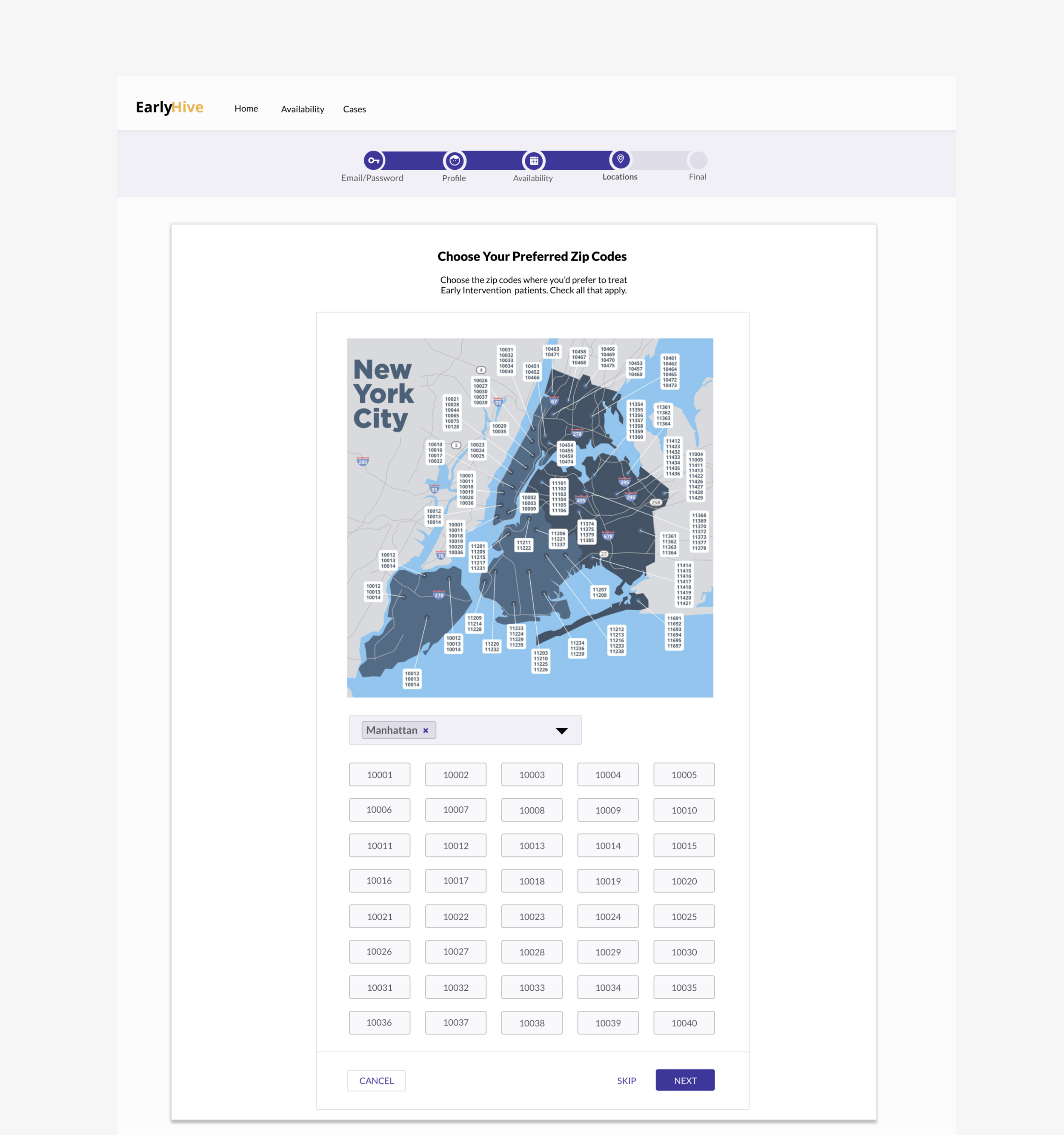
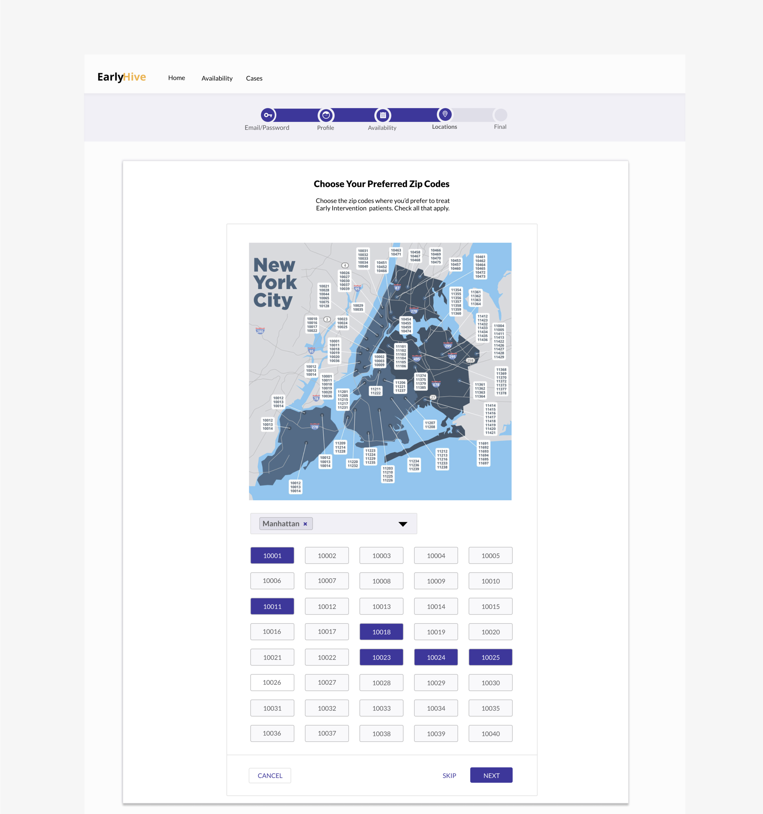
Clickable Map: Allows providers to click on a zipcode and view the available cases. The feature would be part of user onboarding in order to increase user buy-in, foster sense of community with a given agency.
VoIP: Allows coordinators to call providers from his or her computer by enabling a quick “call” feature, thus speeding up the current process of calling multiple providers. (Similar features for text or email could be added to the platform in the future.)
User Flow improvements:
Iterated Prototype Improvements:
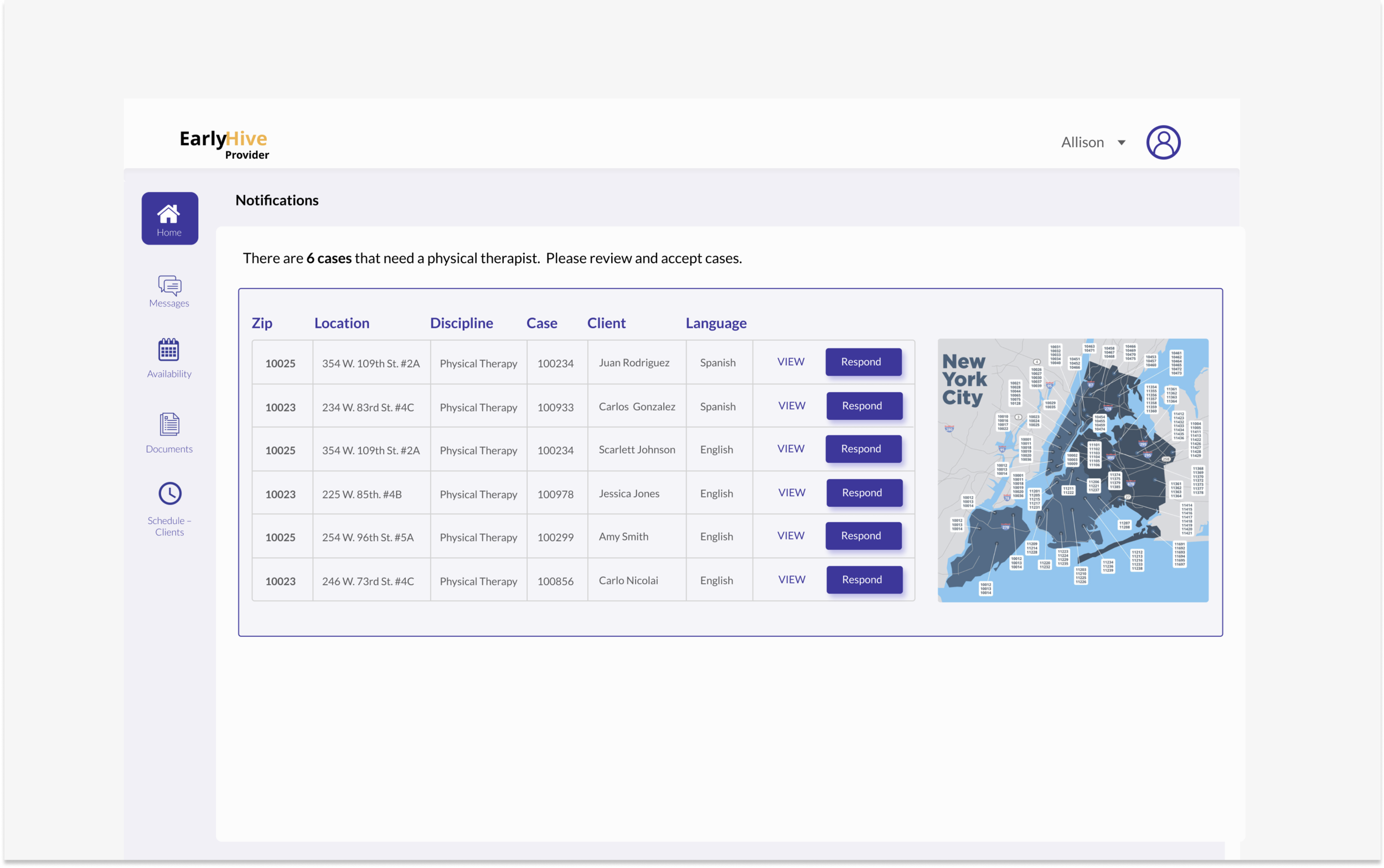
Landing page now includes cases separated; most urgent listed first.
More detailed case information
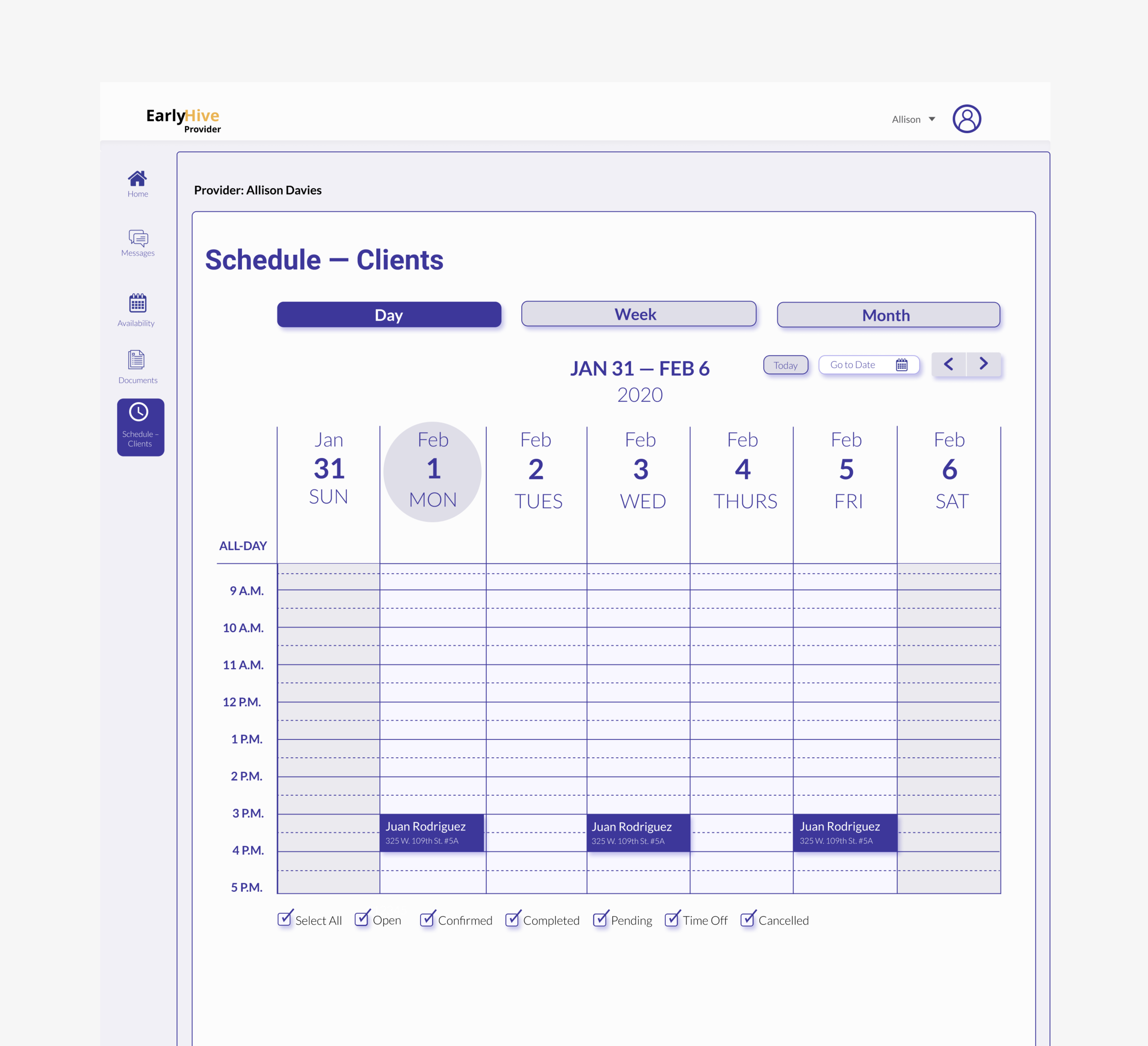
Can click to see calendar.
User kept apprised of chosen case status and ability to recover from errors.
Prototype of MVP
Feature prioritization Minimum Viable Product:
Search and Filtering: Enables case coordinator to search for a specific provider. Features allows search by name or from a list of qualifications (i.e. providers in a certain zipcode, their specialty, etc.).
Contact Information: Providers can find all their clients’ contact information once the provider accepts a case.
Clickable Map: Allows providers to click on a zipcode and view the available cases. The feature would be part of user onboarding in order to increase user buy-in, foster sense of community with a given agency.
VoIP: Allows coordinators to call providers from his or her computer by enabling a quick “call” feature, thus speeding up the current process of calling multiple providers. (Similar features for text or email could be added to the platform in the future.)


