BoardVitals is a medical education company that specializes in prepping physicians, nurses, and allied health professionals for their medical specialty board exams.
My UX role:
As a designer, I used my skills in each stage of the UX process: research, competitive/comparative analysis, visual design, design sprints, prototyping, and usability testing.

My UX role:
As a designer, I used my skills in each stage of the UX process: research, competitive/comparative analysis, visual design, design sprints, prototyping, and usability testing.
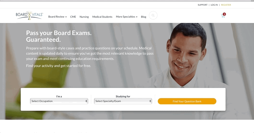
Final Homepage Design & Interaction Design
ABout BoardVitals:
When I joined BoardVitals as UX/UI Designer, there were a couple pressing problems they were trying to solve on their website.
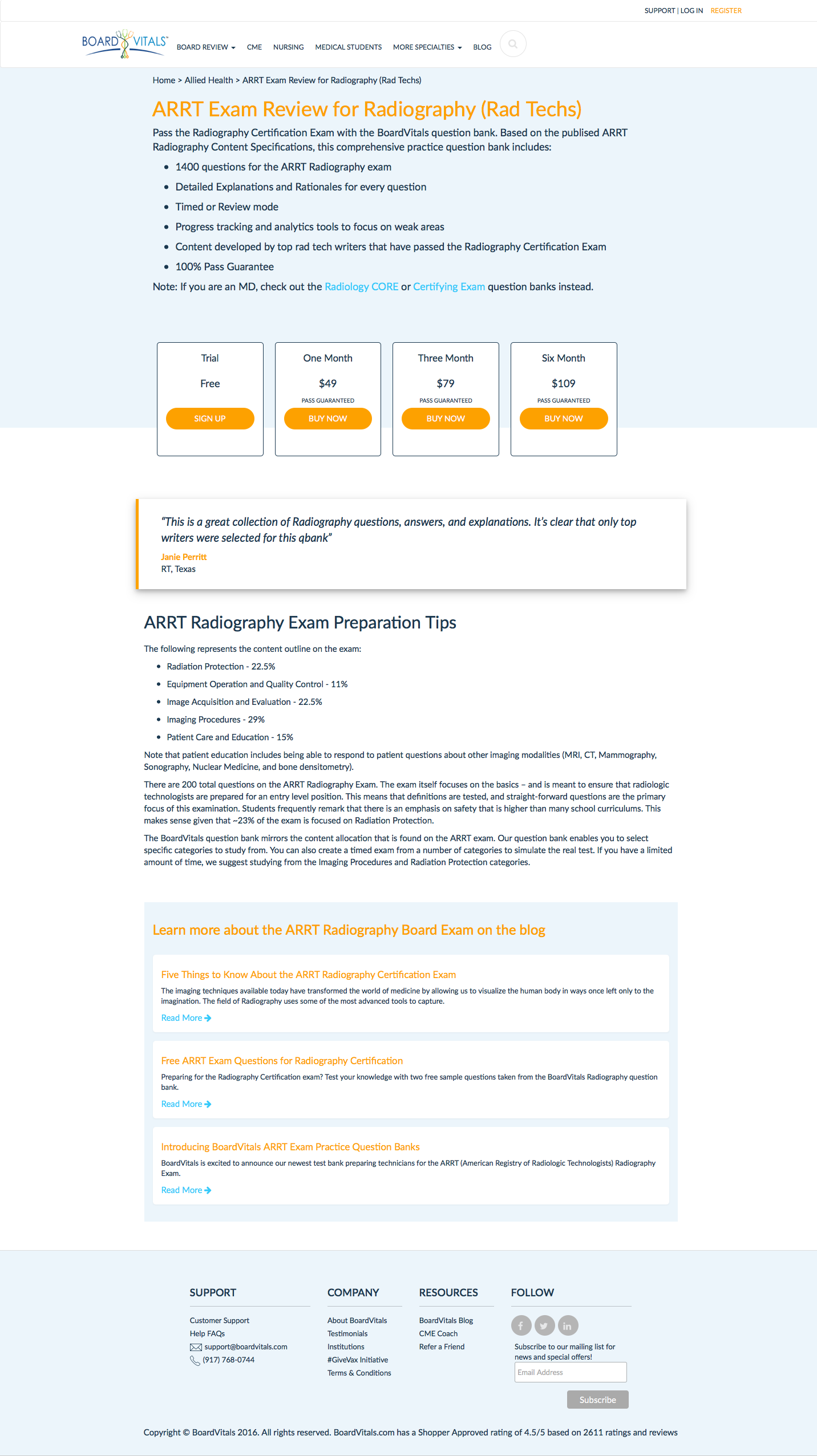
The platform has more than 60,000 questions and more than 150 question banks that help physicians prepare for their exams. The content is updated on a daily basis by medical education writers who have access to the most prominent journals and cutting-edge research in each medical specialty.
Constraints:
Responsive Desktop Websites
Tools:
Omnigraffle, Sketch, Balsamiq, Google, Google Forms, Google Sheets, Trello, Jira
Problem statement:
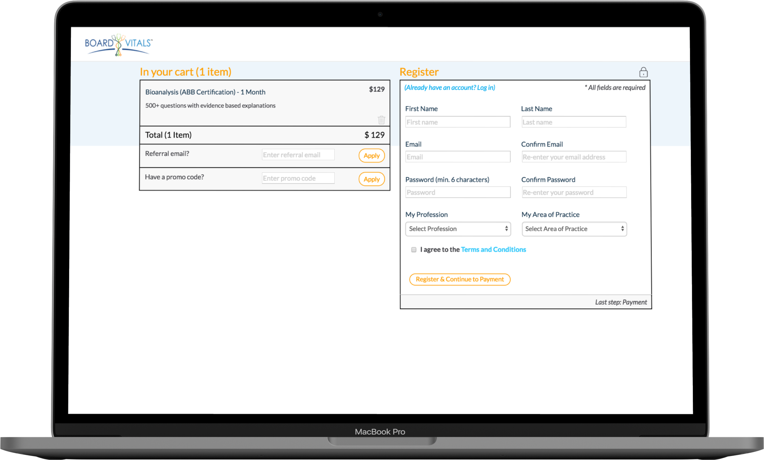
As a UX Designer I was tasked with helping the developers and product manager with several problem areas of their customer purchasing process.
No persistence of product when user abandons cart; No shopping cart, and visitor starts over every visit to site.
Security/trust issues.
Upsell for greater subscriptions lengths, which are poorly presented during checkout.
Continue value proposition of product throughout checkout.
Lack of product information during checkout – where should it be displayed
Design consistency
Post-registration abandonment – current checkout process takes you out of the storefront
THE SOLUTION:
Create shopping cart to ensure persistence of product.
Display value proposition of product throughout checkout.
Signal security of payment information to encourage checkout.
Initial Version of the siTe
The landing page was very text heavy and aimed to establish legitimacy so that physicians would trust BoardVitals to increase exam pass rates.

Homepage Early Iteration
In the early days of the founding of BoardVitals, the website landing page was very text heavy and meant to appeal to multiple audiences. Investors needed to know that content was competitive enough to help physicians increase their pass rates, and the site was also meant to convey content value-add for doctors studying for their boards.
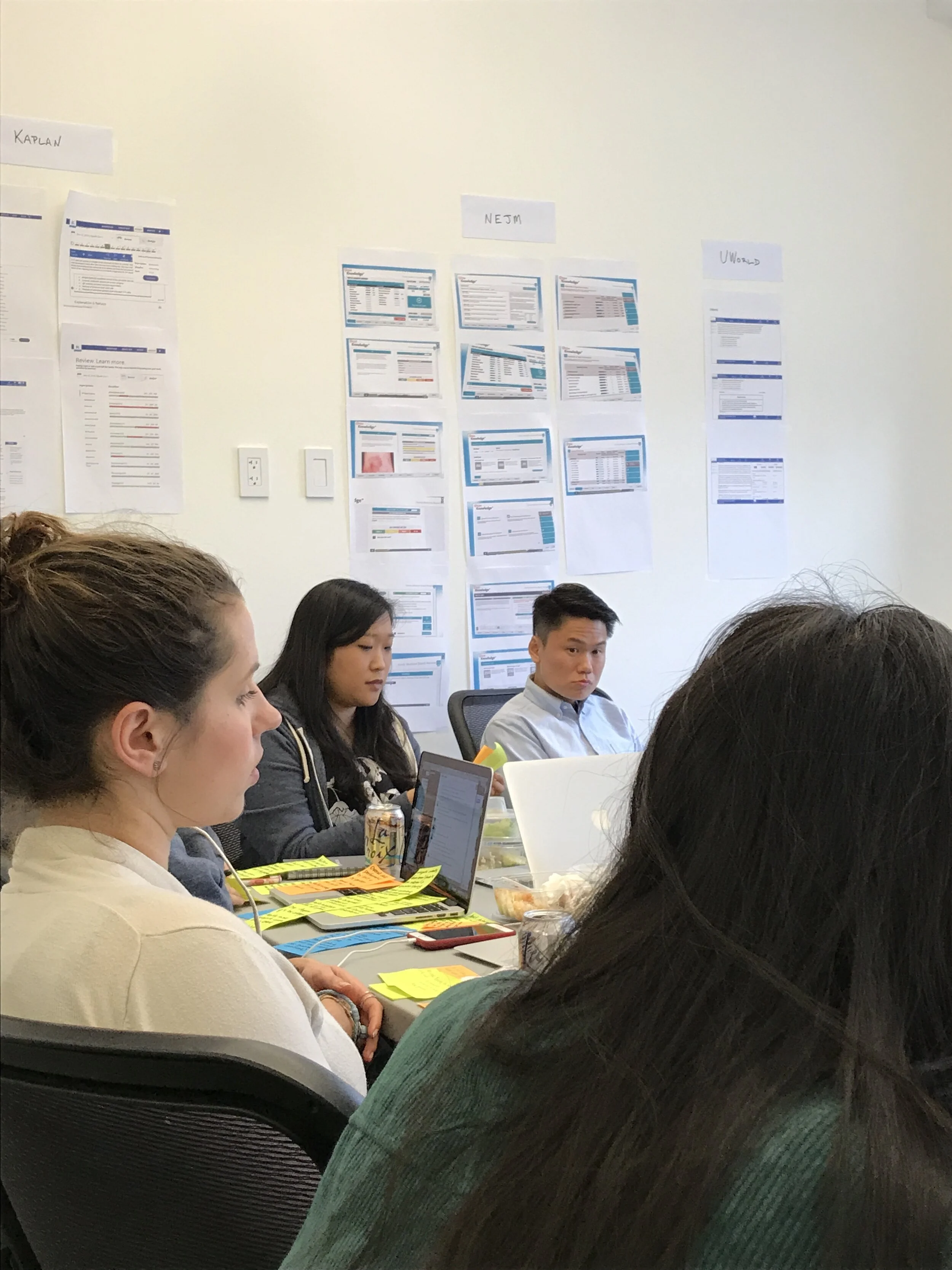
How do competitors market to doctors and help user achieve their goals?
Competitive Analysis
I analyzed a half dozen competitors competitor sites and here is an examples of user onboarding notes: http://bit.ly/2lJu9rk
I found some very helpful insights and best practices we could implement on our site.
Research PHase


Research Considerations
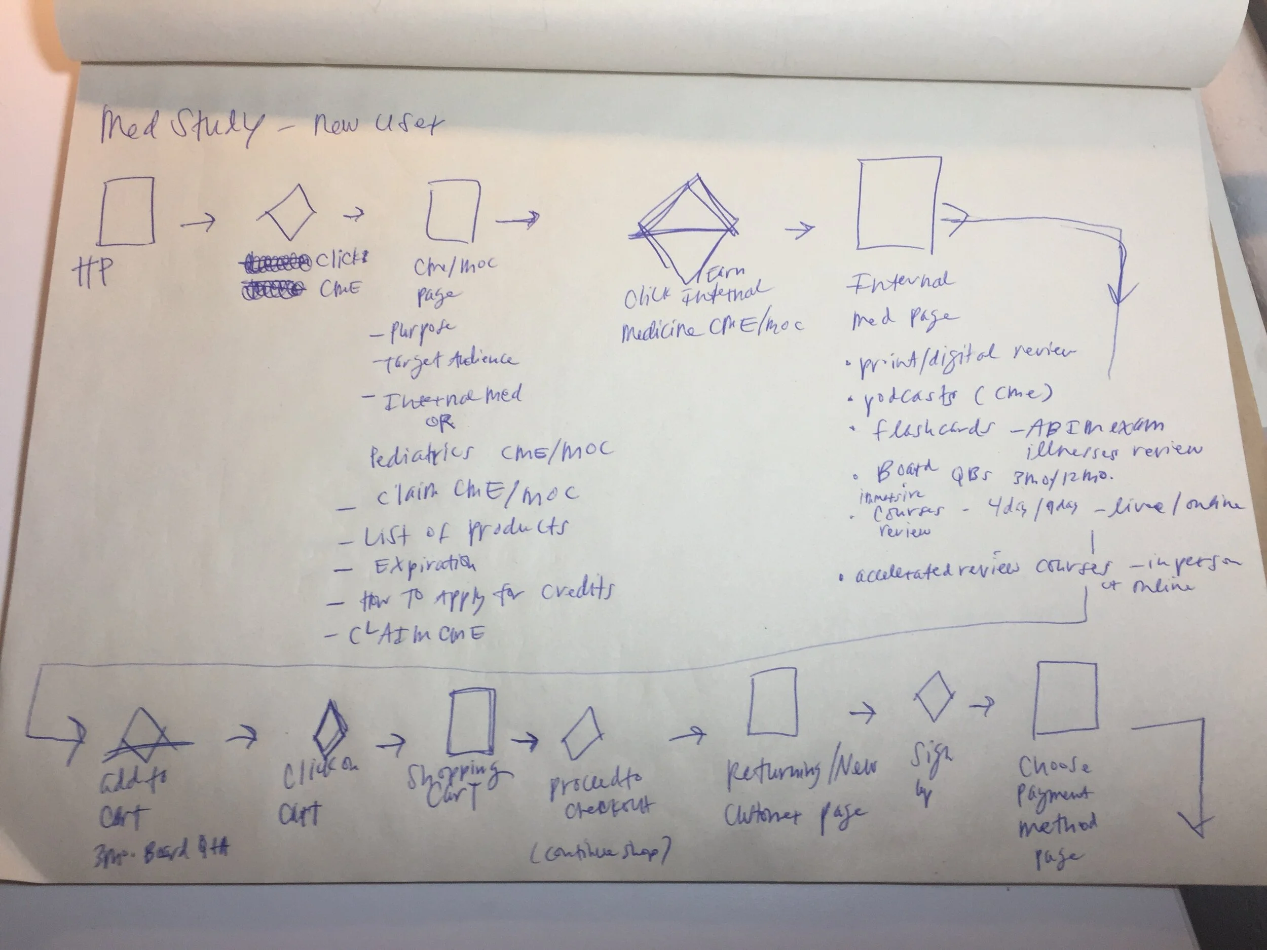
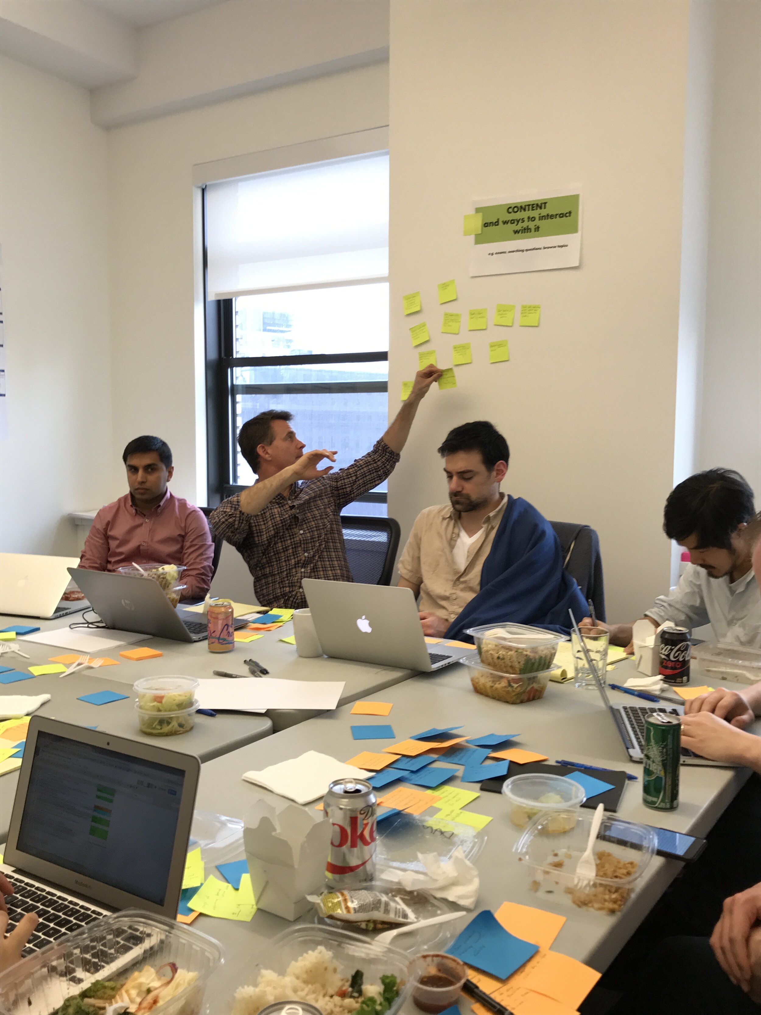
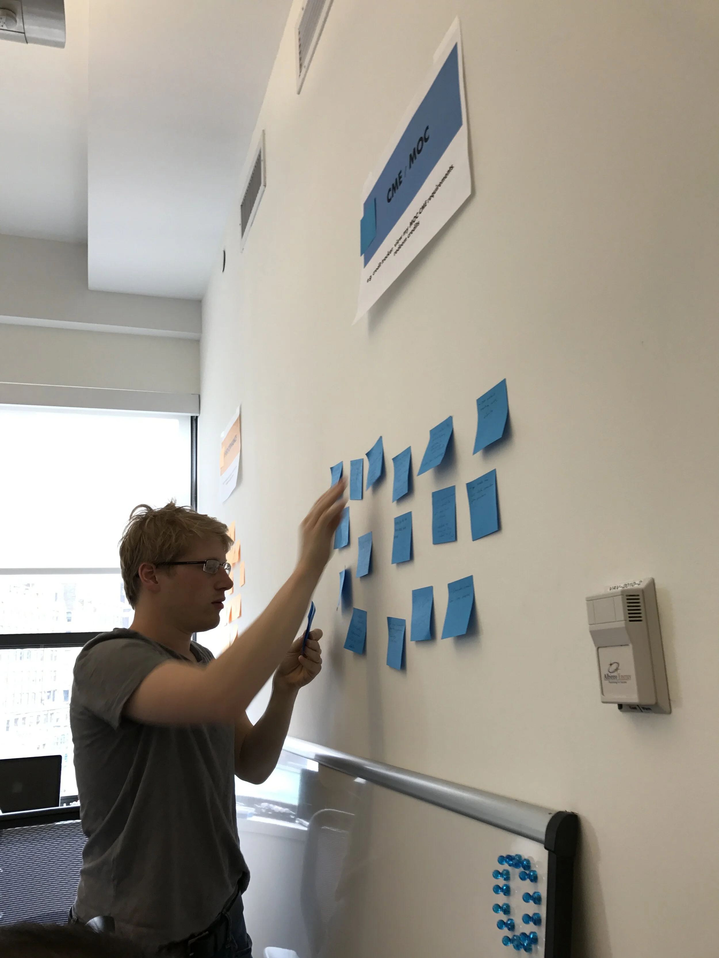
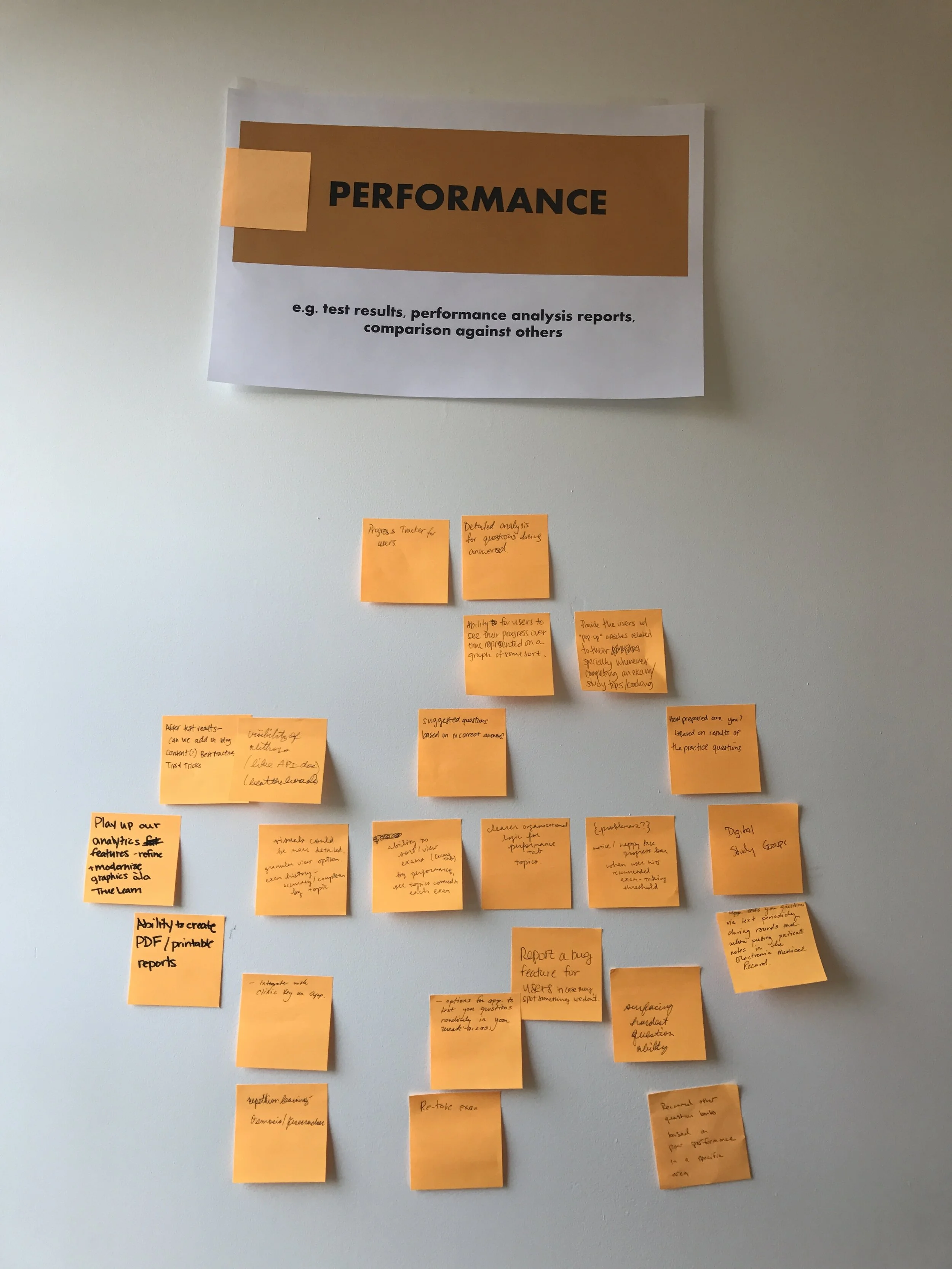
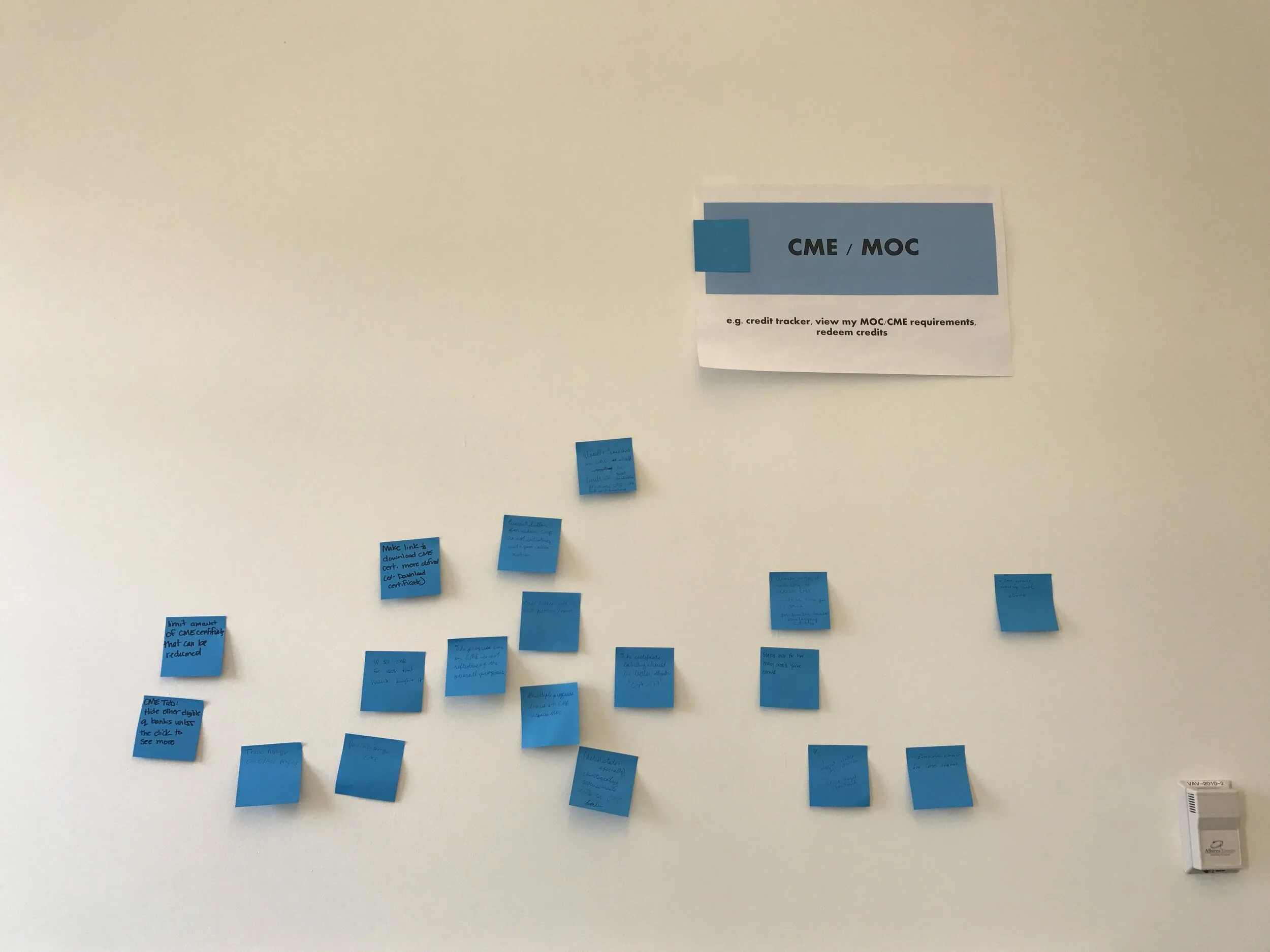
As a team, we gathered to discuss competitors and current content. The design and product management team conducted a brainstorming session to research how to interact with the website to achieve business goals while also meeting user needs.
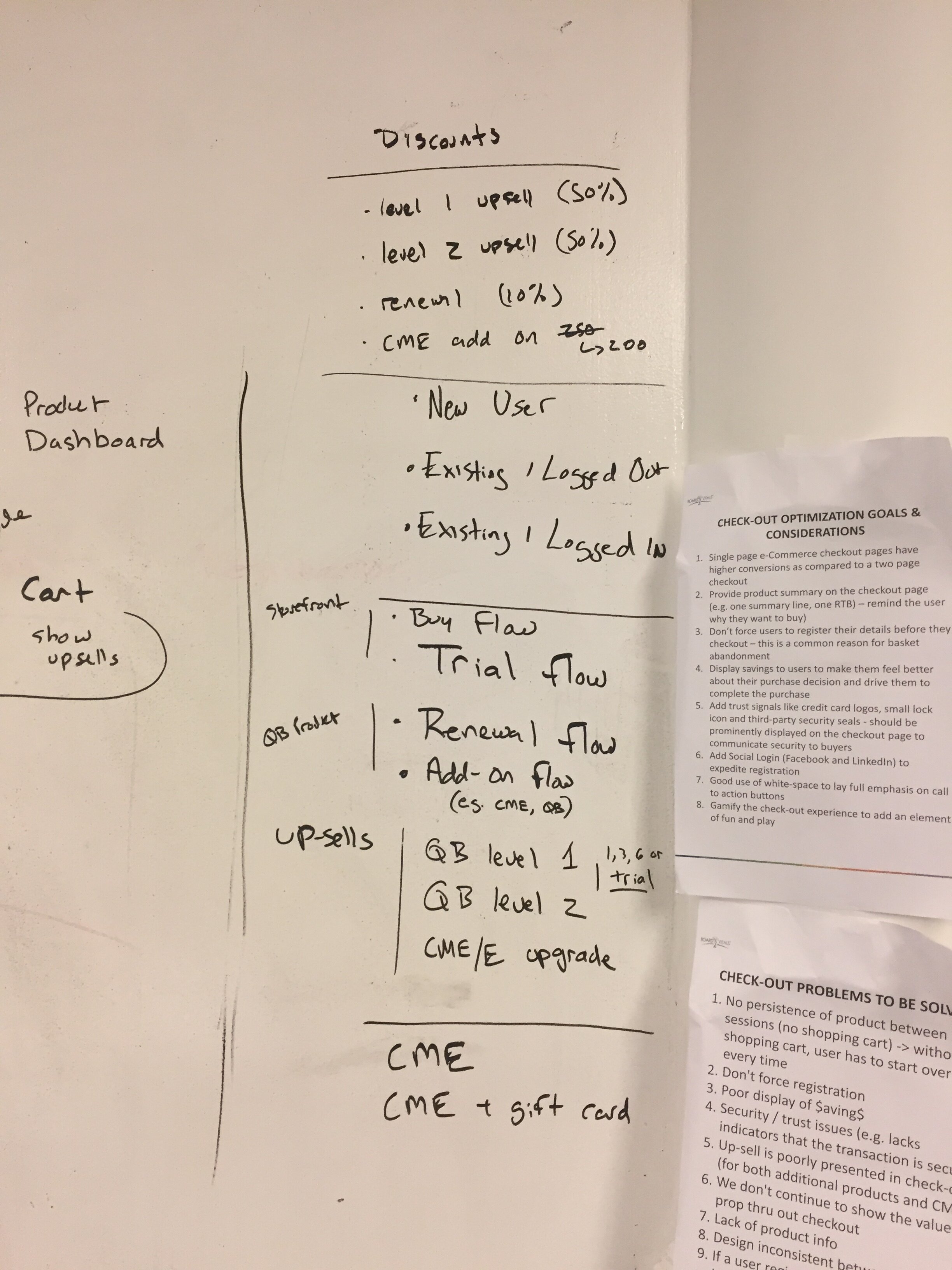
• How to track and redeem CME/MOC credit
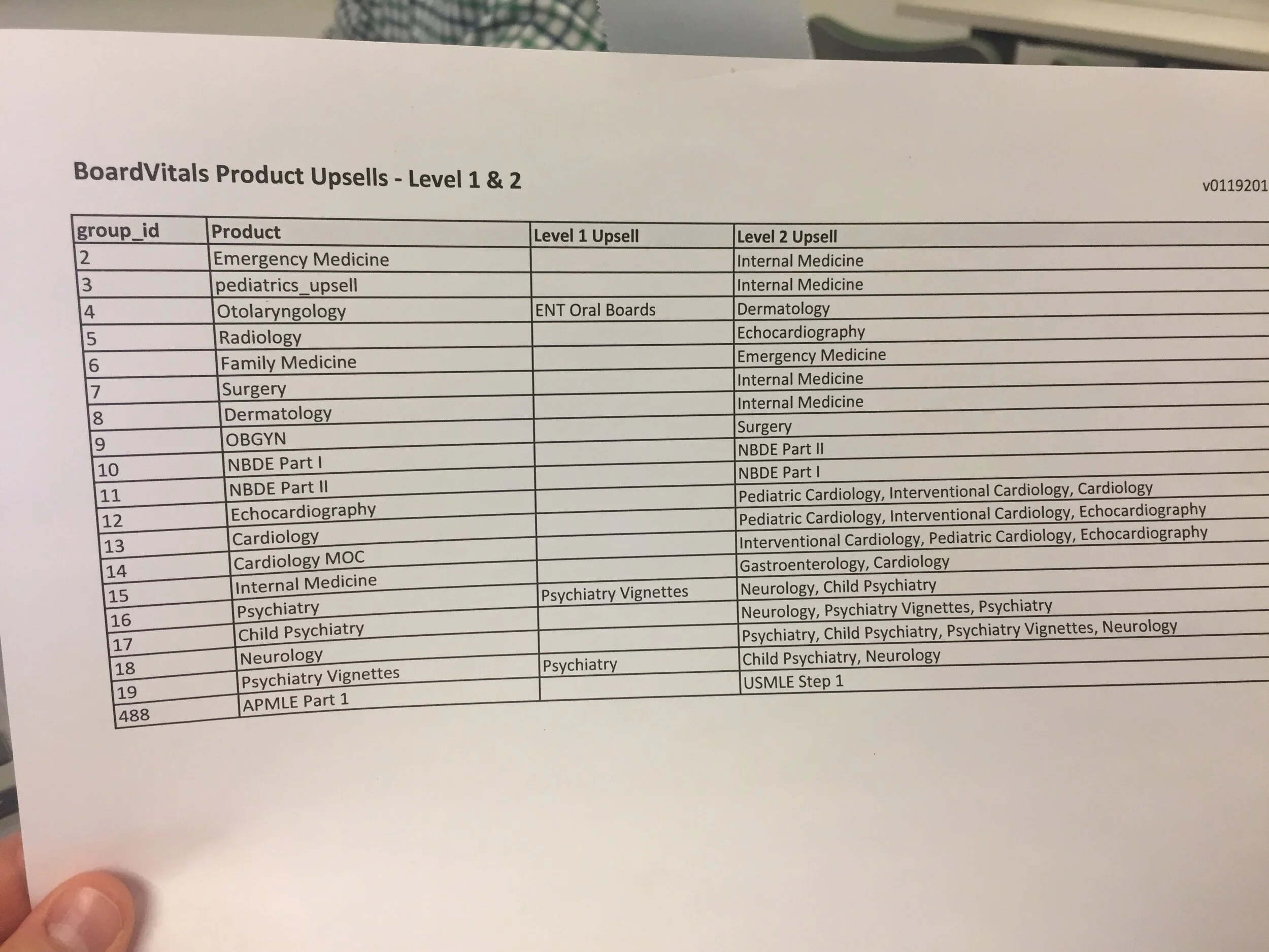
• Performance – how to stay competitive with product offering
• Ways to interact with content – which features should we include? e.g. exams, searching features, or browse topics.
Example of a research questions to the team:
Continue to remind customers of value proposition of product throughout checkout. Lack of product information during checkout. Question to answer is where should that be displayed?
User concerns we found in subsequent research: What’s most important to users? We found they want an interface that looks like the the test environment for the board, quality of the test questions, quality blog content, and ability to study a few questions quickly, in between other tasks.
With this in mind, we can encourage users to make the purchase and upsell other business offerings.
Team-wide design sprint
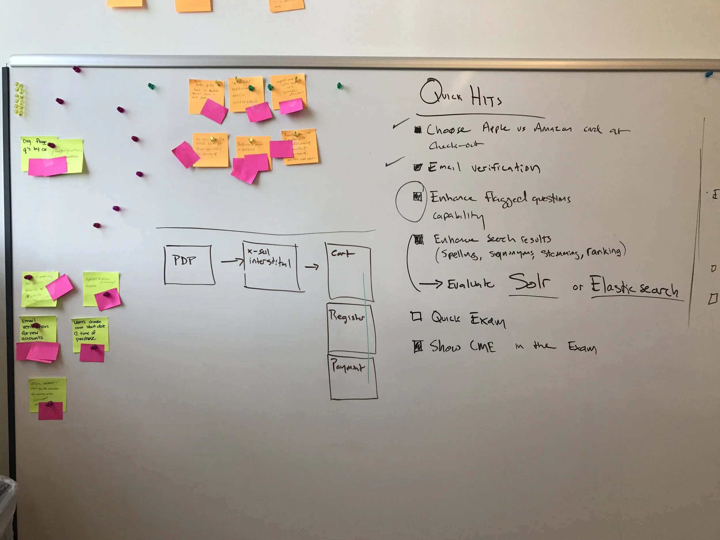
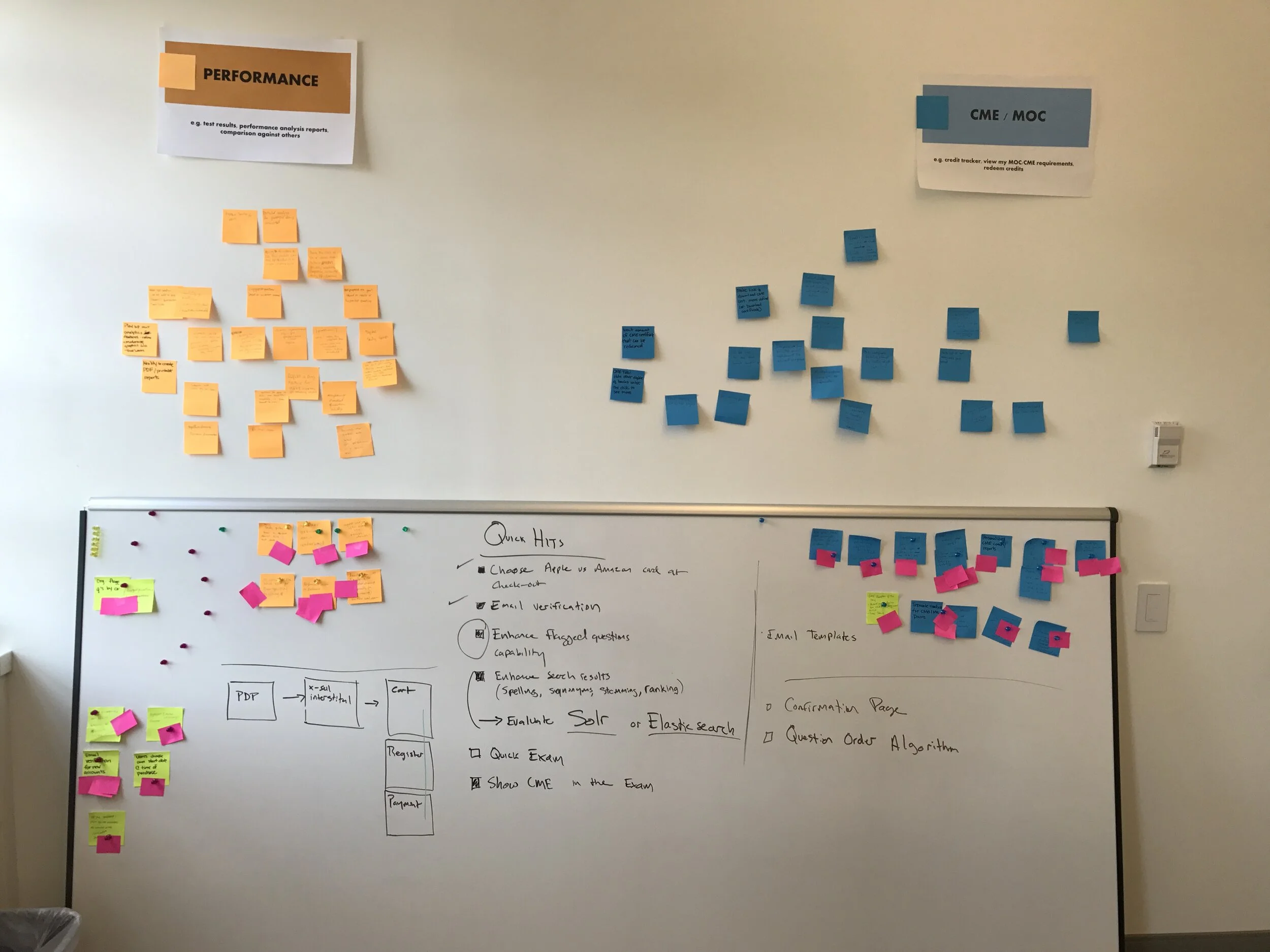
Prototype Phase
With the dev, product, and design team, we did more than a few brainstorming sessions about how to solve some of the most pressing checkout issues.
No persistence of product when user abandons cart; No shopping cart, and visitor starts over every visit to site.
Don't force registration
Security/trust issues
Upsell for great subscriptions lengths is poorly presented in checkout
Continue value proposition of product throughout checkout
Lack of product information during – where should that be displayed?
Design consistency
Post-registration abandonment – current checkout process takes you out of the storefront
Here are some wireframes I created after a few design sprints, including first and second iterations.
User Personas

Design Phase Deliverables
Wireframes in Balsamiq


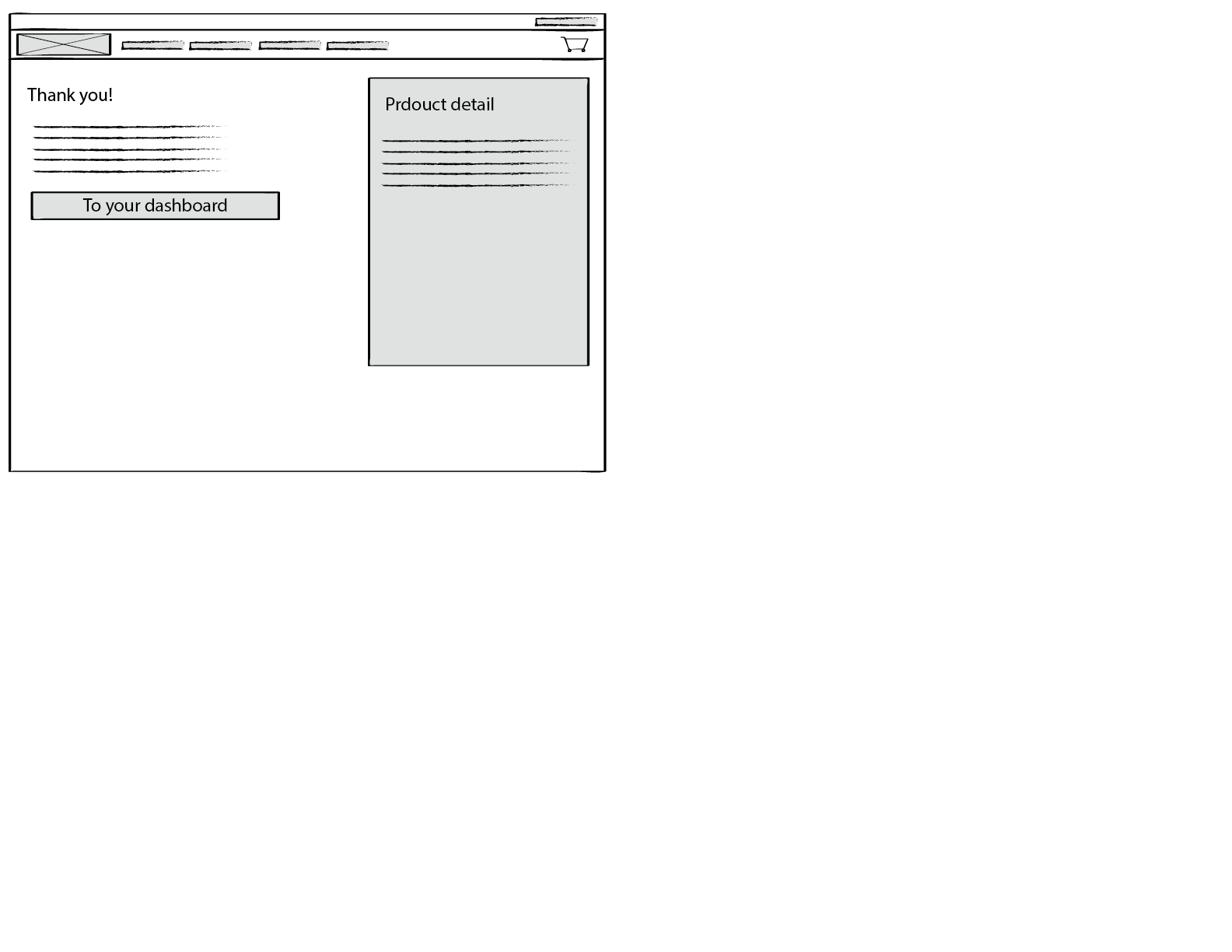


Wireframes with Annotations


Final User Journey

Checkout Flow
Customer checkout flow
Final Iteration Example Images